Pics and Judge's Thoughts: Large Model Catagory (continued):
Where was I again? Oh yeah, just a few more entries in this catagory to go, and on to the winners.
Andy McBeer entered this Warhound Titan, and I'm not sure, but it might be over the size limit for the contest, seeing as it took up an entire shelf in the display case by itself. Yikes! Really eye-catching. Great weathering. Fantastic story base. The only thing I could nitpick about was that the paintjob was a bit flat... it's hard to tell with all the dry pigments used over top, but it looked like there wasn't enough tonal variation worked into the model. If you take a closer look at the yellows, you can see what I mean:
I would have liked to see the yellow fade into ocre, then eventually dark brown, for the shades. As it was, it looked a bit flat (I know, I say that alot regarding large models, but it's one of the most common perils when painting something this size!). The Rhino and Imperial Fist aren't as weathered, so it's even more evident on them how few tones were put into the base colours. Again, this is normally a minor complaint... the whole piece was so characterful and wonderfully ancient looking, I really had fun looking this model over... lots of neat details to discover.
Evan Moore entered this gorgeous Ork Fighta Bomba. Again, fantastic weathering, precise freehand, extra work put into the base, great paintjob on the crew... lots of things I liked. A tiny bit more contrast would have been nice though. More shadows would have made the model more defined, and perhaps a hint of edge highlighting would have helped too. Weathering tends to flatten (or even cover up) a model's contrasts a little bit, so I think you really need to exaggerate your shades and highlights before moving on to that final step. Still, this entry oozes character, and the artist really went to town on it. Fantastic.
Speaking of weathering, check out Gerald Moore's Minotaur tank. This thing looks like it came straight from the pages of one of the Forgeworld books. The gun barrels are scorched, the tracks are dusty, the rivets have rust streaking down from them, the mufflers are rusted, and even the vehicle markings show weathering. Everything is supremely well thought out and executed. And when you think it can't get any better, check out the interior crew compartment:
Wow. The paint is chipped and worn in all the right places (you can almost imagine all the little stones and rocks that get stuck in your boot tread scratching up the deck plating, the rungs of the ladder, and just about everywhere else you step). Big guns like this also kick up alot of dust when they fire... and you can see how it collects in all the nooks and crannies. The crew is reasonably well painted as well, although a bit more subdued in colour than I prefer. I'm also not sure why the guns are less weathered and dusty than the rest of the piece... it looks deliberate though. This is NOT a model that might catch your eye at first glance, but once you zoom in and allow your eyes to wander all around it, it really stands out. I'm not sure if everyone will appreciate how nice this entry was, but I certainly did.
Another fantastic tank was entered by Marshall Reeves from all the way from Kelowna. All the weathering makes it a bit muddled looking from a distance, but Marshall countered that with a really eye-catching freehand dozer blade. It looks like a graffiti artist went to town on it while the crew was out having lunch. Beautifully done, and I regret I don't have a pic of the whole blade... the title of the piece, "Let the City Burn" was painted on as well, and was cut out of this pic somehow. As with Gerald's tank, the weathering is extremely well thought out and placed in all the logical places. However, Marshall uses some older Eavy Metal techniques, and they don't scale as well when viewed up close when compared to some of the techniques used by modern military modellers and the painters from Forgeworld. They do look fantastic when viewed from the gaming tabletop though. Lastly, check out the glass pieces, particularly the spotlight! Gorgeously done, and the super clean shiny look really contrasts well against the grime and beaten look of the rest of the tank. Just fantastic.
On the other end of the spectrum is Bryce Jensen's Deathjack. Like all of Bryce's entries, this was a supremely well-executed "clean" paintjob. There's nothing to hide or distract from his deep, rich contrasts, and razor-sharp precise highlights. This is how I imagine a model being painted if you could someone use a CAD machine or 3D printer to do it. It's like an early Pixar animated piece, made real. Up close or at arm's length, Bryce's models are simply stunning. No lack of contrast as well, which is difficult when working with larger areas. Again, I just wish he would feather or blend his tonal transitions though... it's a bit more obvious when viewed up close on the large open areas:
Notice how each layer or step of highlighting is very pronounced looking? That's because when you place one tone next to another, the area just along the join will be interpreted by your brain as darker or lighter looking when compared to the next tone. It almost looks like each layer or highlighting is underlapping the next. I vaguely remember my grade 8 art teacher explaining the phenomenom(sp?) to my barely comprehending teenage mind. Now that I see Bryce's paintjob, I finally get it though. This is why miniature painters should try and challenge themselves to blend each layer into the last one... it blurs the definitions away, and gives it a smoother finish.
A tiny amount of weathering would have also been nice too, but not too much. A few paint chips here and there would have added visual interest, but too much would hide an otherwise stupendous paintjob.
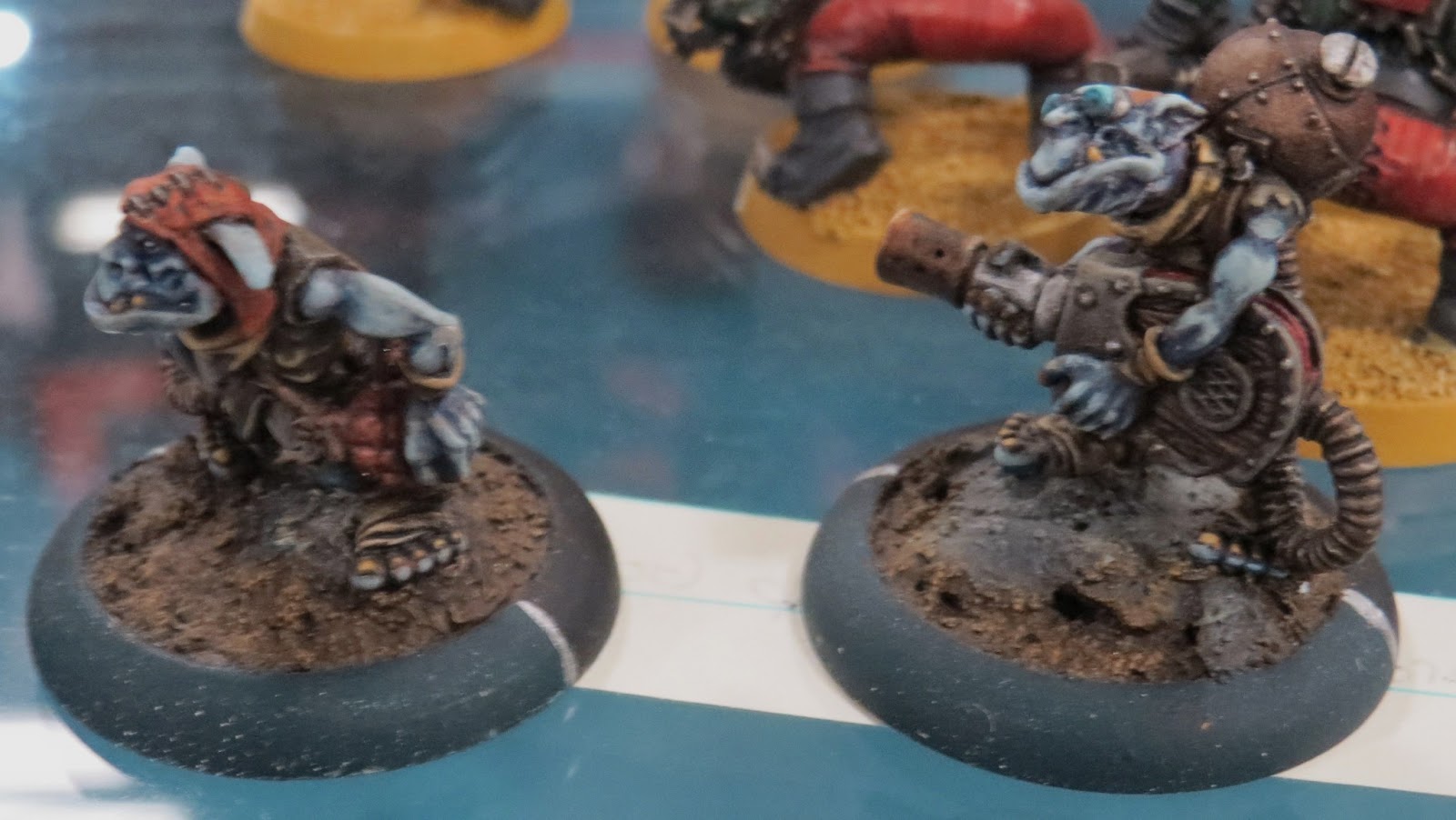
Lastly, we have this monstrously large Trollblood model. Unfortunately, this piece was entered after I had packed up on saturday night, and I didn't get the name from the volunteer who had accepted the piece. If this is your model, please comment so that you can get credit for a really nice bit of work. This artist got quite alot out of a few simple techniques... washes and a nice light touch of drybrushing. Some of the more intricate places got more attention with the brush though (the inside of the mouth in particular), so it's evident the artist has got some skills. The purple veining is a nice touch, although the blue skin and the grey rock are otherwise a bit too monochrome... highlighting up to another colour (such as flesh tones) on the skin would have been nice, and the rocks could have used some subtle grime or dirt. This is the best example I could come up with at a moment's notice:
See how some darker dirt accumilates in the cracks and recesses of the rock? Also how vegetation clings to the sides? At the scale of this model, I'd say it would look more like green slime growing along wherever water would run off the rocks. Otherwise everything looks too fresh, and not outdoorsy enough. It's a tad unnatural looking for anyone who spends alot of time outdoors. However, it's otherwise a spectacular entry, and probably impresses the heck out of any gaming opponent.
So, who won?
Third place was a tie between Marshall Reeves' "Watch the City Burn" tank and Jeremy Fleet's Avatar Warjack. I really had a hard time choosing between the two... Jeremy's warjack demonstrated some amazing blending skills, and Marshall really knows how to work freehand. Both put lots of care and thought into their models as well. I almost gave the edge to Jeremy's warjack, but it turned out that I had an extra Third Place ribbon, so I opted to cop out and give them both third place. Both fantastic works of art for entirely different reasons. I'd love to see the both of them compete again next year, but with deeper contrasts, and a tiny bit of modern weathering techniques.
Bryce Jensen killed it with this standout Deathjack for second place. While I like to bitch about Bryce's highlighting style (I want smoother, damnit!), it's still awe-inspiringly precise, and the way he manages to fit so much contrast into such small areas is unreal. A tiny bit of freehand or weathering would have put this entry over the moon though, and there's something about that head that gets lost in the rest of the model... perhaps doing it up in a contrasting colour or perhaps done much lighter than the rest of the body would have put the focus back where it should have been. Otherwise, I'm stuck with my eyes magnetically drawn to the harsh stepped effect of the line highlighting on the upper armour plate. Damn you Bryce.
Still, first place has to go to Gerald Moore's Minotaur tank. This is the pinnacle of realistic weathering that I've seen so far. I mean, compare that paintjob to something in real life like this:
And you get the idea that Gerald's going for something that actually looks like a working piece of machinery, and not just something from a late '80s / early '90s sci-fi movie set. The interior crew compartment was what sealed the deal for me though. It really scaled extremely well, and was believeable in almost every way (still not sure why the breech area of the guns were so relatively spotless though). Also plenty of shading, unobscured by the weathering. Really loved it, and would love to see more. Congrats to Gerald, you should be very pleased with yourself:
I guess though, in a perfect world, you'd get something like all four top placing paintjobs all on one model. Bryce's super ramped up contrasts with Jeremy's super smooth transitions, Marshall's kickass freehand skills, and Gerald's hyper-realistic weathering. That would be something worth witnessing, although I suspect it would be a massively time-consuming undertaking. Oh well, there's almost a whole year between now and next year's competition...
Showing posts with label miniature painting. Show all posts
Monday, 11 February 2013
Saturday, 9 February 2013
GottaCon 2013: Miniature Painting Contest part 4
Pics and Judge's Thoughts: Large Model Catagory
When we called it the large model catagory, that's exactly what we got. With only a few exceptions, most of the entries were really pushing the 10" x 10" x 10" size limit that our rules dictated (one might have gone over, in fact). But was bigger actually better?
Richard Despres entered this very nice Imperial Guard Valkrye. A very solid entry... nice clean paintjob and precise detailing (including the impressive wing art). A solid gaming paintjob, in my opinion. However, for a painting competition piece, I would have liked to see a bit more contrast (I'm starting to sound like a broken record, eh?). The grey really came out very flat looking, and I had to crank up the contrast when editing this pic so that you could pick out the details. That shouldn't have been necessary... it's the painter's job to do that, not the photo editor. With such large, flat areas, a piece like this really NEEDS deeper shading and sharper highlights. Otherwise the paintjob doesn't scale properly in the viewer's eyes. Miguel Jimenez's technique of colour modulation would have helped immensely, and a bit more weathering might have put it right at the top. By adding those extra steps, this model could have had some real visual punch and interest.
Jason Lindholm's Throne of Everblight suffers from the same problems as Richard's Valkrye, but of course, it doesn't show up as readily on this model. Because the Valkrye had large, flat, fairly featureless areas on it (prior to painting), a flat paintjob was going to compound the last of contrast. This model has deep sculpted detail, so it still comes across as having some contrast. The ambient lighting of the venue tends to catch the deep ridges, giving it some "shading" that the artist didn't put in. Still, without added shading and highlighting, this model won't scale well in the viewer's eyes, and the details don't pop. Also, the green flesh, purple Hentai bitz, and large metal areas are too monochrome in colour... there's not enough variation in tone or colour... Purply veins, earthen undertones, perhaps some lighter flesh tones mixed into the highlights would have broken up the large single-colour areas a bit more. At least the metal areas benefitted greatly from a dark wash, making the embossed details stand out a bit. Lastly, I might have made the base a snow, desert, or urban theme instead. The colour of the green flock is too close to the colour of the green skin, which makes the model blend into the base a bit much. Other than the base, it just seems that model was entered half done... it needs several more hours of work put into it in order to thrash it's competition.
Evan Peters' Keeper of Secrets. This is where things start getting really interesting. Fantastic conversion work, a story-filled base, and tons of contrast. I would have liked to see a few more intermediate tones in the skin... it seems like it goes from nearly white to dark purple too quickly... a slightly gentler transition between highlights and shades would have made it more pleasing to the eye. I'm also a bit torn about the white marble on the base. On one hand, it contrasts very nicely with the richly coloured gribblies bursting from the side. On the other hand, colour-composition-wise it blends in with the white skin of the main subject (the Keeper of Secrets). A centrepiece model like this needs to stand out from the base, not camouflage into it. Still, Evan took a fairly old model that we've all seen way too many times in competitions, and made it refreshlingly new again.
Will Hellbrand's take on Fateweaver (based on the Belakor model) was even more ambitious. Heavily converted, standing on an elevated base, and even featuring some nice sculpting, this model is extremely interesting. It's got contrast, visual punch, and dynamics going for it too. I might have tried shading the turquoise skin with a slight touch of dark red glaze... anything to make it a bit richer. Hard to say... it has depth (plenty of shading), but when I look at this model, I understand why canvas artists shade with colour variations, and not just with black. The highlights could have gone one or even two steps further too, but we're talking about just doing the lightest touch on the tiniest uppermost points. It's about 95% of the way already. Some sort of colour shading on the metals would have been a nice touch too... the problem with painting silvery metals with only black as a contrast / shade, is that it can end up looking a bit monochrone... it ends up looking a bit like a black and white picture at best, and just variations of grey at worst. Anyway, all the above are simply nitpicks... this paintjob reminds me of work I did years ago, and by that I mean it's pretty darn good. Will's a few colour theory tricks away from being a fantastic artist.
Ah, Jeremy Fleet again, this time with a stunning Avatar warjack. You really had to look at this model up close and from a few different angles to really appreciate how wonderful his blending is. Absolutely stunning. If Bryce Jensen's painting was a colour staircase between the heights of Heaven all the way to the depths of Hell, then Jeremy's blending would be like a slip-n-slide, it's that smooth. However, the only thing lacking is depth. I really would have loved to see him stretch his shades a few stages darker... it would have given this model better contrasts, more definition between neighbouring segments, and more visual punch from an arm's length viewing distance. That also goes for the golds (work a bit more dark brown into the shading and silver into the highlights), and the purple cloth (take the edges all the way up to bone). Also, the base could have used a bit more of something... it's "gaming" nice, but not "awesome" nice.
Oh, and check out the shield:
There's that blending I was talking about (even smoother than what I could accomplish with an airbrush). However, that flaming emblem is really something else. I loved it. If only there was some darker shades (maybe even some blacklining) on the embossed gold detail and the rivets...
Aaron Kehler's Scythean, I presume? I'm not super familiar with Hordes models, but I'm think I got that right. In any case, beautiful tonal transitions. Good contrast, although if Aaron ramped up the highlights on the bone a bit more, and pushed the shading on the blue-grey skin a bit too, that would have really impressed the heck out of me. The base also lacked any visual interest for me though, and the fact that it was done in the exact same colours as the skin was a real let-down too. In a competition, bases are part of the painter's canvas. They simply can't be ignored... after all, it's 100% certain that the judges won't ignore them. Otherwise a very nice display of technical skill from an obviously talented artist.
Lee De Kock really had me stumped with this model. It was somehow familiar to me, yet I couldn't place which range it was from. Turns out it's a pre-production model of "The Madness", from a really interesting game I was looking at on Indiegogo (like Kickstarter, only more international). "Drake" didn't make it's funding goal, but I sincerely hope they try again, and I would love to see Lee's paintjob work it's way into the promotional marketing for it somehow (check out the website here). I love the base, and the colours he's chosen, and how he can blend one colour into another, regardless of their relative positions on the colour wheel. Again, I'd like to see the highlights brought up a bit more (contrast... it's like cowbell for miniatures. "I need more cowbell!"), but this was a really nice paintjob regardless. Take a closer look at this beastie's face, for example:
Fantastic, and the stuff of real fantasy art. If only the highlights went up another stage or two, this would really have made my day.
Phil Turner's Land Raider was back into more familiar fare. Again, these models with their large flat areas can really end up looking flat if you don't do something special with them. Back in the old days, I used to just highlight the sh*t out of anything approaching a hard edge. Nowadays, I recommend Mig Jiminez's colour modulation theory instead. However, Phil turned a standard fare gaming paintjob into something a bit nicer when he added some weathering. There's some streaking going on (who doesn't like streaking?), and some soot and muzzle scorchmarks as well. All that extra work tells the painting judge that you're going the extra mile to impress. I only wish Phil had added a bit more tonal variation on those large flat areas and I would have been very very happy.
And here's a really big 'un... a Woldrath by Kim Daynes. I liked the glowing rune effects, and really liked the interesting and dynamic base (the Woldrath is shoving aside a tree in order to get to grips with the enemy, while a sorceress narrowly escapes being stepped on). This paintjob just needed a bit more shading to get the amount of contrast it really needed. Also, a bit of weather streaking and grime would have helped give it that outdoorsy look, instead of looking like it came fresh from the quarry. A good job overall, and I especially loved the extra work put into the base.
Nick Marshman's Mycetic Spore had some visual impact for sure. From the colour choices, to the modelled on fleshy hooks, and especially the mirror-shine gloss finish, Nick really seemed to be trying to get the viewer's attention. I also think there was some kind of irridescent finish going on with the exterior shell too. Hard to pinpoint exactly what I would have done differently with this model, but I would have toned down the shine (perhaps go with a satin finish instead of full gloss... it looked like a glass finish rather than something organically slimy), added more detail to the base, and tried going for smoother tone transitions in my colours.
Well, that's most of the entries in this catagory covered. I'll finish up Large Models in my next blog, and rest assured, it won't be a long wait. Feel free to post your own thoughts and comments... I'm always happy to respond.
Thursday, 7 February 2013
GottaCon 2013: Miniature Painting Contest part 3
If you haven't already, please check out the previous blog entry on my judging style. It'll give you some more insight into the decision process involved in this year's competition, and hopefully give you a better chance at any future competitions (or just help you create more eye-catching pieces).
Well, back to the Squad / Unit entries for 2013.
Ryan Despres' 15mm Flames of War Artillery Battery was the only small scale entry this year. Very nicely done example of the genre (super itty bitty WWII models... so cute!). While I have seen Warmaster models do very well in painting competitions, even stacked up against larger models, they tend to be the exception, not the rule. I really like Ryan's little battlefield details... the camo netting in particular tell a story. You can imagine these guys desperately tossing up this "cover" in order to screen them from enemy aircraft. However, the smaller the scale, the more important your contrasts become... otherwise the details get all muddled together. Throw camo into the mix (camo is designed to break up your recognizeable profile, obscuring details that would make you identifiable), and you've got some really nice gaming pieces that would look fantastic on the gaming table... but perhaps not as great in a dedicated painting competition.
Jon Calvert's Thunder Cavalry are wonderously dynamic. His paintjob does not detract at all from the flowing sense of motion captured by the sculptor. However, contrast needs to be ramped up a few notches... more highlights, and definately more shading would have helped this entry. The yellow on the shields especially... I would have started with a dark ocre colour, and built up the yellow highlights over that. Blacklining would also help the eye identify the individual details. I would also have made the stones on the bases a darker colour... the grey is much too light, and just fades into the white of the snow effects at a distance. Again, solid gaming pieces, and probably looks amazing as part of his overall army, but they need more work to pass the scrutiny of a diehard painting judge.
Alex Yeun's Eldar Rangers were very striking. They immediately jumped out at me, and were able to stand out in a crowd. Great colour composition, TONS of contrast (you can almost never have enough, in my opinion), and nice brush control. When viewed up close (and I mean, really close to the eye), the heavy and thick layering was a bit jarring though. It was straightforward line highlighting, which is fairly easy to do, once you've developed a nice steady hand and good brush control. Perhaps if Alex thinned down his highlight colours a bit more (try using a wet palatte, or perhaps mix in some matt medium), and used twice the number of layers, it would have come out looking much smoother. The bases were nice too, but could have used a little extra detailing to really put them over the top. A light coat of Testors Dullcote to seal them would have helped kill the excessive shine as well. Just a few steps shy of fantastic, but nearly there.
Brenna Anderson-Dowd's only been painting for a few months now, and these are some of the very first models she's ever painted. I sincerely hope they are not her last, because she has an enthusiasm for the art that is wonderously joyous. These are much better than any of the models I ever painted in my first year of painting, so she's already ahead of most painters in this regard (I'll have to post pics of some of my first paintjobs one of these days... I still love them). She's already laying down some impressive highlights (see the fighter on the left), and even painting the eyes (demonstrating guts and brush control). I would advise thinning down your paints, and not trying to get full colour coverage on your first coat. By laying down multiple thinner coats of paint (allowing each coat to fully dry before applying the next), you preserve the surface detail better. Still, a solid start to a lifelong hobby, I think.
Jason Lindholm's Stormguard are well done in just about every regard. Excellent brush control, some nice highlights and shading, nice bases, and all the detail is easily recognizeable. The only thing I can really say is that they are a few steps shy of where they could have been. I really wanted to see more contrasts (deeper shades, lighter highlights). The bases are fairly standard fare... well done, but nothing exciting. This is a great example of excellent gaming / tabletop quality painting, but it lacks the exceptional quality that would make it a competition standout. All the skills are demonstrated, but not enough passion and extra time invested. This entry is the equivilant to comfort food, not haute cuisine. While pleasant, they're not spectacular or memorable. Regretable, since all it would have taken would have been just a bit more painting time to push the envelope a bit further.
Apologies for the horribly blurry pic of Bryce Jensen's Necrotech and Scrap Thralls. These models are an example of what I think Jason's Stormguard could have been, had he invested more time in them. Bryce has just so many more layers of highlights and shades on them, the contrast is absolutely stunning. Every segment and component jumps out at you from any viewing distance. His brush control is so sharp and precise, I don't think Bryce is a real human (I'm sure that if you peeled the skin back from his head, you'd see the Skynet trademark stamped into his metal skull). The colour selection is absolutely spot on... at first they look like the standard colours straight from the studio paintjob, but I'm certain there are a few pigments mixed in that aren't in the usual gamer's repetoire. However, the bases are interesting, but lack that really mucky texture that would have suited a swamp better. Also, at close inspection, the highlights are layered on a bit thick, with easily discernable "steps" from one tone to another (a little bit of wet blending or some feathering would have been an effective, if time consuming fix).
Chris Brakefield's GorkaMorka Gang were easily overlooked at first glance, but put a huge smile on my face once I took a closer look at them. His technical skills were well demonstrated, but it was the sense of quirkiness infused into them that I really liked. All the multi-part models were posed in dynamic contortions that I could easily see Orcs getting into. Great contrast, and subtle but nice details (scratched up shield even). However, bases were very uninspired (the type of base you do when you just want to model finished and game-playable), and I think he could have pushed the highlights a bit more, particularly on the reds, metals, and even a bit more on the green skin (mixing a touch of Bleached Bone or Rotting Flesh might have helped).
So who won?
Third place ribbon went to Chris Brakefield's GorkaMorka Gang. Technical proficiency was sharp. And the whole gang was just smothered in fun. Even now, I'm just noticing little details like the sky-earth reflection in the gobbo's goggles. A few more steps invested in these models, and this could have placed higher yet, but I still had no problem with this unit being on the podium.
Second place went to Jeremy Fleet's Blood Angel Terminators. I know I bitched a bit about his contrasts not being as pronouced as I would have liked, but his blends were "Neet" (ie, silky smooth like a supermodel's legs). Red is also an incredibly challenging colour to pull off well. My only other beefs with this entry is that it's nothing really different from the Eavy Metal paintjobs, and if you simply follow the established path, you will always be held up against their standard of work.
So, who won first place?
Not a big suprise to many, but Bryce Jensen took it with his Necrotech and Scrap Thralls. They're the models that grabbed the most attention due to his razor sharp precision and incredibly pronounced contrasts from the staggering number of tones in his shading and highlighting. Bryce's paintjobs are possibly the pinnacle of what I would call, "Tabletop Quality" painting. There's a solid workmanship involved, and would be the highlight of just about any gaming army. However, there's just something missing from them that would elevate them to eye-searing art. I struggle to put my finger on just what it is, but here's my best guess:
He needs to learn to blend better. Seriously. Simply laying down one highlight after another isn't going to cut it at some of the painting competitions I've been at. If only Bryce would feather the easily discernable line from one tone to another, his colours would blend together SOOOOO much nicer. Perhaps experiment with wet blending (Alison McVey has an excellent video on the technique here). However, this is what works for Bryce... he produces dazzling armies in a minimum amount of time invested. Wet blending and feathering would add to the time necessary to complete his models, so whole armies would be a challenge to complete that way. One technique that may work for him, since it's basically what he already does, only more time-consuming, is layering with progressive glazes. Since a layer of glaze doesn't have as much pigment strength, it basically tints the highlight or shade on. This allows for more gradual colour / tone transitions, but you need to start with a lighter base coat colour, and it will take at least twice as many layers. It also takes precision and patience, but Bryce has both those qualities in abundance.
Also, I don't see anything really out-of-the-mould here. Standard Cryx models, with a semi-standard paint scheme. Warmachine models don't really lend themselves to easy conversions either, so it's hard to blow people away with something incredibly original. However, these models came straight out of Bryce's gaming army, so it wasn't likely that he was going to remodel these models from the ground-up with greenstuff.
Regardless of all that, Bryce is still on a level that's hard to comprehend. And the fact that he can casually toss off these paintjobs in the same way that you or I would fold our bedsheets or brush our teeth makes him that much scarier. Imagine how much deadlier he would be if he attempted the next step in his painting.
So congrats to Bryce Jensen, winner of the GottaCon 2013 Best Painted Unit / Squad catagory.
To everyone else, THIS is the guy you're gunning for. It's do-able... just keep studying the art of miniature painting, and practice like crazy. The future CAN be saved from Terminators like him. ;)
Next blog: the Large Figure catagory!
Explanation of judging process for painting competitions
Well, no coffee and / or breakfast yet. However, I'm up (kinda), and I feel the need to explain the judging process a bit before moving on to the next GottaCon 2013 Miniature Painting Contest entries.
People always say that judging in painting competitions is subjective... "the eye of the beholder" and all that. Well... yes and no. It's true that no painting judge is entirely objective. However, there is a bit of a process that you need to understand in order to improve your chances of being in medal contention.
When viewing a large number of entries, a judges eye will pass over them fairly quickly at first. Just as most of the 'con goers did, we circle the display cases, and our eye picks out certain things. That's why your models need to POP at an arm's length distance. There needs to be something really nice that works at that viewing range. Often it's a massive amount of contrast. Sometimes it's amazing freehand. A nice display base helps elevate the entry over the surrounding ones, and if it's detailed, then it also adds interest. If your models don't stand out somehow when placed amongst a crowd of other models, then it's likely to have a slimmer chance of getting the judge's attention.
Next, judges examine the models up close to try to pare down the contenders into a small manageable number... usually 6 or so (double the number of medals, typically). This is what I like to call, "The Final Cut". The easiest way to do so (at least, in good concience) is to do so on technical merit. That means that any kind of imperfection is a good excuse to eliminate your entry from being in the top 6.
Sloppy brushstrokes? Down in the standings you go.
Crosseyed model? Yeah, better luck next time.
Unfinished bases? How can I pick you over someone who actually FINISHED their models?
Skipped a step or two? Could have been a contender, if only you had added some much needed blacklining, or dullcote to kill the shine from overuse of inks.
You see, judges feel guilty when they knock entries out of contention. We feel for the artists, since we're artists ourselves. We know how it feels to put lots of time and effort into something, feel pretty good about it... only to have someone else disagree with your choices and value your skills / efforts less highly than you do.
Eliminating entries based on technical merit makes this a bit easier on us. It's easier to say to a person, "Man, you could have been one of the top 3, if only you had removed that ONE remaining visible mould-line running along your model's bicep!" It means that the painter is skilled enough that they COULD have won, but for one or two slight misteps / omissions.
Just as a personal (and painful) example, I once managed to pay for a plane ticket and hotel room out in Toronto for the Canadian Games Day and Golden Demon awards way back in 2002. I brought 5 entries with me, and due to a massive mistake made on one entry the night before (I was trying to make some last-minute touchups), only entered 4 catagories on the day of the competition. I placed fourth through sixth in all four catagories, but speaking to the two judges at a staff party afterwards (I was no longer a GW staffer, but knew enough people to get in), the Eavy Metal painters told me that one entry in particular was just about to be given the silver demon, when they noticed that my bolter barrels weren't drilled out. One silly little oversight cost me the chance to call myself a Golden Demon award-winning painter for the rest of my life. After shelling out a huge chunk of my savings to get across the continent to compete, it was incredibly frustrating, but at the same time, very understandable. I could not fault the judges at all, and they made the right call.
Still, my buddy Jason Dyer still bugs me about it every time he sees me. Thanks man. I think he's just bitter that I got closer to winning the much coveted Demon than he did. ;)
Judges also look for some visible display of a painters overall painting level. I'm a fairly knowledgeable painter... I've tried wet blending, progressive glazing, layering, feathering, airbrushes, precision washes, edging, and (*shudder*) drybrushing. I know a big bag of tricks for achieving highlights and shades, and can usually recognize which ones another painter has used. I also know which ones are the most challenging to pull off well. An entry that shows use of a quick wash and drybrush is not going to place as highly as one that had buttery-smooth wet blends and time consuming progressive layers of thinned down glazes. Not only does the drybrushed model represent a fraction of the time spent on the blended model, but it also shows a much more elementary skill set utilized. It's also likely to not look as nice.
I've also noticed that most hobbyists get distracted by painting gimmicks. Things like OSL (object source lighting), NMM (non-metallic metallics), and even SENMM (sky-earth non-metallic metallics) are very cool effects one can achieve with some practice, but they need to be done in the right context. I've seen WAAAYY too many models where OSL was simply not necessary ("Gah... another glowing lava base? What, do all Space Marines walk over 2 minute old lava fields when engaging the enemy?"). These tricks are good for catching the viewer's eye, and drawing them in, but if I consider them distractions if overused or ill-placed. It's like driving downtown with your monster truck to get groceries, or going 5 km an hour down Robson street (Vancouver's version of Rodeo Drive) on your Ducatti motorcycle. Nice ride, but you're a douchbag showoff, and deserve my contempt, not my admiration.
Lastly, many judges are pretty jaded people. We've seen plenty of models, whether it's in person, online, or in print. We often see many of the same models, with the same paintjobs, by any number of different artists. We get mentally tired of seeing the same thing, just like you would. We need something new and refreshing to catch our attention, and wow us. Something different to excite us. And that's really hard to do, especially considering that I'll see hundreds, if not thousands of painted models in any given week or month. Since we're viewing your stuff in person, you have an immediate advantage over the stuff we've seen online or in print, but it's also easier for us to nitpick the details (no Photoshop). If you can think of something that no other painter in the competition is going to try, perhaps that might help. However, if you think you didn't pull it off 100%, maybe consider entering something else that might not have been as ambitious, but was technically better. At the end of the day, it's still a painting competition first and foremost. Not a gimmick contest, not a conversion contest, and not a basing contest.
That being said, if there are two equally well painted entries, but one has a neat conversion or base, it will get the edge. However, they have to be equally as well painted (or better) than the rest... conversions and bases are tie-breakers, not deal makers. They won't be valued over a better paint job by an experienced painting judge.
So, after reading all that, you may get the impression that painting judges are out to get you. We're looking to bash your beautiful work. It's our job to crush your dreams and aspirations, and step on your fragile egos like a steel-toed boot crushing a butterfly just emerging from it's crysalis.
Ummm... well... what can I say? It's a hard job, but someone has to do it.
Look, I have nothing but admiration for anyone entering a painting competition. You've already earned my respect for just handing your beloved works of art over to us. I've been there more times than you know. During my professional painting years, I used to enter a painting competition of one sort or another every month or so, and only placed in a handful. I've travelled down to the States to compete, flown across an entire continent to compete, shipped entries to GW HQ for various White Dwarf competitions, and even entered a number of online painting competitions. I've entered competitions that I had no chance at all to win. It takes guts to compete.
However, win or lose, it's ALWAYS been worth it, to me at least. Competing pressures you to finish models. It also gives you the extra urgency to make you push yourself to new levels, and master new skills. It makes you think outside the box, and outside your comfort zone. And if you're lucky enough to get any kind of feedback from the judges, it gives you new directions to develop your talents.
Of course, one of the toughest parts of competing is that you are not painting to satisfy your own sensibilities, preferences, and art style. You are painting to satisfy someone else. You will need to master styles far outside your own to demonstrate technical mastery, but infuse it with your own style in order to make it stand out from the others. And that's insanely tough.
Anyway, I've rambled on enough for one blog entry. I hope this gives you some insight to the judging process, which will hopefully improve your chances of winning. Of course, like the cliche goes, winning isn't everything, but sometimes it's nice to have a shiny trophy, medal, or ribbon in your fig case next to your models. It's a tiny bit of sweet validation for all your hard work, and it can get very addictive. That drive to win has one good side to it... it can motivate you to continually get better. Just make sure you're still having fun painting... that still comes first.
Wednesday, 6 February 2013
GottaCon 2013: Miniature Painting Contest part 2
The Squad / Unit Catagory
The painting competition was split into three catagories: Single, Squad / Unit, and Large model. I'll start with pics and thoughts from the Squad / Unit catagory, as it had the least number of entries. (and it's just before bedtime as I write this).
There were a few rules involved with this catagory, but most noteworthy was the footprint. The entry could not take up more than 10" x 10" x 10" in space. We only had the three display cases, after all! They also had to number at least 5 models, which we forgot to take into consideration until just before the judging, otherwise we may have reminded a few of the entrants upon accepting their entries. Sorry about that guys.
Jeremy Fleet entered a fantastic Blood Angels Terminator squad from the Space Hulk boxed game. At first, there was some confusion, as he entered a similar squad last year, and contest rules state that entries can not have been entered in a previous competition (not just GottaCon either). However, things were straightened out before judging, and I went ahead with examining his models.
Some very nice blending. Strong contrasts (although a bit more shading / blacklining would have made me happier). Red is a tricky colour to highlight, as too much highlighting often comes out looking pink or orange. Jeremy could have pushed the highlights a touch more, but probably not much more than that. The metals were nice and smooth, but some matt black blended into the recesses would have made them more striking. Not to mention a touch of bright metal highlights would have thrilled me. Still, a super solid entry, with nice attention to detail, amazing brush control (precision all around), and only a complete nitpicking a$$hole like myself could come up with anything bad to say about this squad.
Will Hellebrand entered a fantastic Cryx battle group. The first thing that jumped out at me was the nice paint chipping... everyone knows I'm a sucker for weathering. Other than that, painting was solid. Bases had lots of beautiful texture and interest, although an extra bit of edged highlighting would have given the rocks a touch more definition and depth, and a tiny tiny bit of vegetation (dead or alive) would have been nice too. If you look really really closely (and I mean up super close) at the overall highlighting, it seems like they were layered on a bit thick, with little to no blending or transitions. The bronzes could have also used one or two more levels of highlighting too. Not obvious until you bring the model right up to your eye, but that's what a painting judge will do with any painting finalist. At this quality level (and Will's models were of very nice quality), judges tend to look specifically for imperfections. Anything we can find will make selecting the final three a little bit easier.
Aaron Kehler's swamp goblers were also very nicely done. Very much competition quality, and easy on the eyes. However, contest rules state that the entry must be 5 or more models, and I only saw two. Sorry about that Aaron.
I've got a few more entries to go over, but I've run out of typing time tonight (gotta get up early tommorrow, and I'm keeping the wife awake). I'll finish off this catagory first thing in the morning, after breakfast and some coffee. Apologies to anyone reading this late tonight... please check back in a few hours, okay?
Tuesday, 5 February 2013
Back From GottaCon! Contest Pics and Thoughts ( Part 1 )
So, back from GottaCon in Victoria. If you're not familiar with GottaCon, it's an annual gaming / pop culture convention (miniature gaming, board gaming, role-playing games, and also video gaming) that's been going strong for 5 years, and attendance is good (the 24,000 square foot venue is packed). In years previous, I've done the judging for the painting scores of the Warhammer 40K and Fantasy tournaments, ran drop-in painting clinics, and for the first time this year, judged the miniature painting competition.
There's alot to say, and alot to show, so I'll post up my GottaCon thoughts and pics over a few separate blog entries.
First impressions?:
This is a pic of just one half of the miniature gaming tournaments. Double this, and you get an idea of how many miniature gaming enthusiasts were here. Sure, it's no GenCon, but considering the cost of the ferry ride to get to Victoria, it's pretty decent. That, and this pic was taken at about 9:15am on saturday morning... most of the gamers hadn't even gotten here yet.
We had three Ikea display cases for the miniature painting competition. Again, this pic was taken very early in the day, and entries continued to pour in. Eventually, we had filled up most of the shelves with some very nice looking models. They drew in interested con-goers all weekend long, and garnered quite a bit of attention, along with many many "water-cooler" debates and conversations as to who should win. I also heard quite a few "Oh My Gawd... take a look at THAT model!" from obviously impressed people.
I also managed to drop by the Gamers Silent Auction area before things really started going on Saturday. This was a fantastic idea... drop off your excess gaming stuff (models, books, video games, comics, etc), bundle them up into saleable lots, do up a quick write-up on them and give them starting bids, and let the Con volunteers take bids on them all day long. As a buyer, you can find some amazing out-of-print and used items, and place bids on them. Check back once in awhile to see if you've been outbid and need to consider upping your bid, and at the end of the day (I checked with the volunteers early the next day), you may end up with some great bargains. I managed to unload two boxes of used gaming stuff, picked up a used model for less than half retail, and still made out with enough money left over to cover the cost of my ferry ride to the island and back. In the end, I was very happy, and I suspect my wife is too (two less boxes of "crap" cluttering up our teeny tiny condo? I bet she's thrilled!).
I was very busy helping to run the competition, taking in entries, organizing notes, and running a drop-in painting clinic at the same time. I did manage to step outside for a breath of fresh air (ventilation in the arena is awesome, but there's still just so many people packed into the place), and found two amazing food trucks (one serving Mexican and another serving pulled pork dishes... it was heaven!). I got myself a pulled pork sandwich, and sat down to watch a show put on by the local SCA (Society of Creative Anachronism... medieval recreationists):
Impressive stuff, and way better than sitting in the nearby mall food court, listening to elevator music. I've got a few friends who are heavily into medieval recreation, and while I love the history (and would love to collect a few choice pieces of arms and armour one day), I just can't see myself joining the SCA at the moment.
Still, this doesn't top last year... they had some of the 501st ("Vader's Fist", an international club of Star Wars fans who dress up in costume) hanging out by the food trucks. I nearly laughed my head off when Darth Vader and Boba Fett posed with one of the chefs while a Jawa raised his fists in the air and yelled, "Poutini!". :)
After a great sandwich and some cold liquid caffeine (I like to alternate my caffeine intake through the day... hot, then cold, then hot, and maybe some more cold... it keeps my body on it's toes), it was back to the Con, and my painting clinic, where I demonstrated various painting techniques and tools to anyone who was interested:
I dragged along a ton of stuff to the Con for this clinic. Miniatures (both finished and work-in-progress), small display cases (purchased at Magic Box Hobbies in Vancouver), brushes, tools, paints, lamps, extension cords, blow dryer (for drying paint in a hurry), wet palattes, water containers, and even all my airbrush stuff (never again... the compressor, airbrush, and airbrush accessories took up a ton of room in my rolling luggage, weighed a ton, and people barely asked about airbrushing at all).
Lots of great questions were asked, techniques and tools explained and demonstrated, and I hope that people came away with a sense of "I can do this", and a plan for getting to the next stage of their painting prowess. People seemed appreciative enough, and I think I'd like to continue running painting clinics in the future.
That's about it for my first blog entry regarding GottaCon 2013. Next, I'll put up some pics of the various contest entries, along with some thoughts of what I liked about each one, what I didn't like, and where I think they could have been improved to get them to the next level. For the most part, every entry was fantastic, and could easily have won a trophy or ribbon, but there were just some that managed to do some things so amazingly well that they deserved the win.
If you're one of the painters from the competition, or someone even thinking of entering painting competitions in the future, I advise you to check back and read the comments while checking out the pics. It'll give you a great idea of what judges are typically looking for in a winning entry.
Monday, 28 January 2013
Drop-in Painting Clinic at GottaCon in Victoria... with Yours Truly!
Just a quick mention that I will be running a drop-in miniature painting clinic on Saturday and Sunday of this upcoming weekend. It all takes place at GottaCon in Victoria, B.C. Not only will I be at your disposal, ready to answer your questions, offer feedback and pointers on your paintjobs, and able to demonstrate just about any technique and tool at my disposal, but I will also be judging the painting competition.
So if can make it out to Victoria this weekend, bring your models, bring your brushes, and bring a few paints. I would love it if you pulled up a chair and took advantage of me (in all the ways that my wife would allow, of course). This is NOT a formal lesson... this is for painters of ALL levels to come by and get constructive feedback in a friendly fashion, and hopefully together we can get your skills to the next level.
I've attended the last 2 GottaCons, and they have been a blast. Whether you're into video games, RPG's, miniature games, card games, board games, or any other kind of game, this is definately the place to check out. Great vendor area, great events, interesting guest speakers, and generally a fun atmosphere.
Hope to see you there. For anyone who misses out, I'll be taking pics and posting them up here afterwards.
Subscribe to:
Posts (Atom)