Wednesday, 30 April 2014

It's okay to suck. Even Dave Grohl says so.

I came across some quotes by Dave Grohl, the inspired musician behind the Foo Fighters and Nirvana.  And he's got me thinking about the notion of perfection in art.


Nowadays, people are obsessed with perfection.  The internet has made this trend much worse.  When you look around for pics of painted miniatures, it's only natural to look at the works of the best miniature painters out there, but what does this do to your psyche?

I constantly hear people bitch and moan that they will never attain that level of skill.  That it's not even worth the effort to try.

Did you ever stop to consider what would have happened if people like Marike Reimer, Karol Rudyk, James Wappel, or Victoria Lamb thought this back when they were comparative newcomers to painting?

I'm not saying that people shouldn't look up to the masters of miniature painting.  Studying their works should be inspiring, not depressing.  If every canvas artist that ever looked at the Mona Lisa ended up giving up on painting because they weren't automatically as good as Leonardo DaVinci, then art would have ended back in the Renaissance.

What you need to do is just paint.  Paint without inhibition.  Paint without worrying about being judged.  Paint whatever you enjoy.  Paint big projects.  Paint small projects.  Paint with the full intention of screwing up a paintjob, and a perfectly good model.  Paint to learn, not to be perfect.  Paint to fail, because that's perfectly fine too.

This stuff isn't life and death.  No one is going to die because you couldn't paint NMM on your Blood Angel special character model as well as Darren Latham.  Your first attempts might be totally laughable, but that's okay.  Your next few attempts might be nearly as tragic, but that's okay too.  Eventually you'll either get it, or you'll develop your own style entirely (which will be just as valid as what's been done by others).

But to give up trying is crap.  If you say, "What's the point?  I'll never be as good as that", those words just go to show how fragile your ego is.

Harsh words?  Yeah, but I've heard the whiny cop-out by way too many people, over the course of way too many years, to sugarcoat how I feel when I hear people give excuses as to why they don't TRY anymore.

I find beauty in the most fundamentally flawed paintjobs.  There are just some paintjobs where you can almost see the effort that went into them.  When an artist stresses and stretches their limits, and really tries to get better, that's beauty.  It doesn't have to be perfect, because perfection isn't necessarily art.  Art is emotion, and investing emotion into your work is what's important.

Technical skill can be marvelled at, if that skill is earned by practice and perseverance.  What people need to understand is that they just need the willingness to learn, and to try.

On that note, I'd like to voice one of my other pet peeves: people who get too comfortable with their current skill level, and never try new things for fear of messing up a bit.  It may feel like a step backward to them (dealing with frustration is something they're not used to after being in a comfortable rut for so long), but trying out new techniques and tools is always a step forward.

I know people who are absolute masters at certain aspects of painting.  One guy is a tremendous speed painter, able to crank out fully painted armies practically overnight.  Another guy can produce the most flawless blends, but hasn't shown much interest in painting freehand, or other effects.  Another is a master conversion expert, producing wondrous and unique miniatures out of spare parts, but then just slops paint on it haphazardly.

The thing these painters / modellers have in common is that they are afraid of pushing into areas that they aren't as confident in.  They dismiss the value of other aspects of painting, holding only their specialty up as legitimate, and of paramount value.  What that tells me is that they lack the courage to try improving in other fields, for fear of their efforts not living up to the high standards they have set out for themselves in the field that they are most comfortable in.

Let it go, people.  Who gives a sh*t?  Forget the fear of failure, and just give it a try.  It's not life and death, it's just paint on a model.  Just play around with your projects, and try new things out, and don't worry about what other people think.  Even if you think you are hot crap on a stick, find something that scares you and give it a try.  Don't be afraid to feel like a scared new painter all over again, and try and reinvent yourself once in awhile.  Get out of your rut and boldly go in new directions.

We just need to let go of this idea of perfection in art.  It's BS, and if we obsess about it, we're never going to just let loose and have fun.

And that's the thing.  Nirvana wasn't the most perfect band in the world, but back in 12th grade, I thought it was sheer chaotic awesomeness.  I have to admit that I'm not the biggest Foo Fighters fan, but I really like Dave's philosophy about music, and would like to apply it to my art.  Maybe in the end, I'll end up having more fun.


Saturday, 29 March 2014

Miniature Scale Meets Real Scale! Why Miniature Painting is Weird

Sable and Spray's main mission has been to bring you, "Musings and Inspiration From the World of Miniature Painting".  Now, what exactly does that mean?

In a nutshell, it means that I'm somewhat obsessed with anything to do with miniature painting, and just about all aspects of it.  And I want to share that obsession with everyone I can.  

Unlike many (perhaps most) of the miniature painting blogs out there, the majority of my posts are rarely about my own painting and documenting my WIP's (works in progress).  Perhaps I would do more posts like that, but the sad reality is that I find it difficult to find time for painting these days.  But somehow I still seem to manage to browse the Net and see what else is going on, dig through my rather extensive collection of miniature painting books and magazines dating back to the mid-eighties, and pop into gaming and art stores every so often.

However, there are times when I come across something so very inspiring, that I log it away in my mind for future reference.  One such project I'm contemplating is a fusion miniature-scale / real scale project.

A what?

Well, consider the fact that we build and paint miniatures about an inch tall in real life, that are supposed to represent characters that are approx. 5-7 ft tall in a fantasy / sci-fi setting.  It's a fundamental tenet in our art medium.

In doing so, there are certain techniques we employ to give that teeny tiny model a somewhat realistic (but honestly, it's really quite stylistic) sense of scale.  We hyper exaggerate the highlights and shadows, so that the implied lighting looks like how light would fall upon a full size human (or elf, dwarf, orc, alien, etc.).  The sculpted details are often hyper exaggerated as well... for example, the size of the eyes are huge in comparison to how big they would be on a real person's face.  We do this so that the viewer can still make out recognizable details on an inch tall lump of lead / pewter / resin / plastic at an arm's length.  Even though all those details are grossly out of proportion to reality, our brains readily accept them.

Why?  Because humans have been doing this in art form for so long, we just don't notice it any more.

Let's look at stage makeup.  In order to better make out facial details from afar, makeup is incredibly bold, and details that help identify the character (like wrinkles) are painted on the same way you would on a mask.  This is so that the guys in the cheap seats way at the back of the theatre can still get a sense of which actors represent which characters, and what the heck is going on.

Let's look at comic books.  If people actually looked like superheroes, then we'd all have zero body fat, muscles plumped up worse than a steroid-monkey, and legs the length of a giraffe's neck.

How about cartoons?  Blimp sized heads, eyes the size of oranges.

Just as an example, let's look at the scale of the weapons on our miniatures as compared to weapons in real life.  The pistol I'm most familiar with is the Sig Sauer P226 DAK, as those are the issued pistols at my work.  It's 34 oz in weight, 5.5 inches long, and 7.7 inches long.  It's reasonably unobtrusive when worn on the hip (doesn't affect running or wrestling much), and a little bigger than my outstretched hand (I won't compare its length to other parts of my anatomy).


In contrast, a laspistol or autopistol in Games Workshop's Warhammer 40,000 lore is a massive beast of a gun.  While supposedly one of the smallest and most ineffectual weapons of that fictitious universe, they are easily as long as some model's forearms, and as tall as ping-pong paddle.  If you could imagine a pistol the size of the largest hair dryer you have ever seen, then you get an idea of how exaggerated the size of most weapons are in sci-fi and fantasy.

But put all that aside for just one second.  Imagine for a moment, what could happen if you mixed miniature scale with real scale?  

Not going to work, some might say.  It would look really weird, some might say.  But remember the huge success of the movie, "Who Framed Roger Rabbit?"


When this movie first came out in 1988, it was groundbreaking.  You never saw animated characters interacting with real actors before (as far as I could recall).  It took a few minutes to get used to it, and then your brain just accepted the whole thing.  It was absolutely delicious for a Saturday morning cartoon addicted kid like myself (even though I was just starting high school at the time).

It takes a certain amount of "out-of-the-box" thinking, but couldn't a mixed-media approach like this be applied to miniature art?

Well, other people thought of this a long time ago, and it's been done pretty darn well on a few occasions.


1988 not only brought us Roger Rabbit, but also "Pour Some Sugar on Me" by Def Leppard, crack cocaine, and the incomparable Bolt Thrower. That year also saw Games Workshop publish a book called, "Fantasy Miniatures", and in it, Darren Webb brought us a mug of snotlings.  This pic absolutely blew my teenage mind.  It was whimsical, fun, well executed, well painted, but probably wasn't great to drink out of.

It wasn't until the start of the 21st century that we saw something comparable.


As far as I can tell, Coolminiornot launched sometime around 2000-2001.  In 2004, they published their very first CMoN Annual.  Sometime inbetween, Dirk "Brushguy" Stiller posted up this pic of his take of a "Tempest in a Teacup".  According to the description in the 2003 CMoN Annual, it was simply titled, "Hippogryffe Rescue".

Upon first glance, I saw the incredible water effects that he did.  Incredibly vibrant, super rich contrasts... this was something far beyond the poured clear epoxy resin that everyone else was experimenting with at the time.  While clear resin is neat stuff, it's not all that stylized... it scales well to a point, but it doesn't portray turbulent water the same way a fantasy canvas artist would.  It works great for relatively calm water, but Dirk's approach seemed to work much better for the impression of rough seas.

Once my eyes had feasted their fill on the water, they started to take in the amazing paintjob of the miniatures.  Gorgeous blends, well defined detailing... what more could you ask for?  But wait... what they heck did he use for a display stand???

Oh my freaking gosh.  It's a fricking tea cup, spoon, and saucer.  There's even a cube of sugar on the side.  That particular detail didn't jump out at me at first, but once I did notice it, I couldn't get over it.  It was one of the neatest presentations of a mini-diorama I had ever seen.  The choice of a clean white porcelain was ideal... no crazy prints on the side or saucer to distract from the main subject matter.  The size of the cup and saucer also gave it the perfect amount of negative space to frame the diorama perfectly.  In short, it was brilliant.

Then, about a decade later, I came across this:


Raffaele Picca of Massive Voodoo fame produced this wonderful diorama in 2012.  According to the Figure Art book they published a little while back (it was an Indiegogo project that I was fortunate enough to get in on), this is a 54mm model, which means that this tea cup is probably closer to the size of a small soup bowl.  However, instead of little bits of nori and cubes of tofu, Raffaele put this in his bowl:


Yup.  Those are tiny little fish he made for the diorama.  I'm guessing he laid down lots of layers of clear resin, and suspended the hand painted fish throughout.  This way, they were suspended in the water effects at various depths.

I won't even go into how great the painting is for this diorama.  Instead, I'll focus on the composition and decision making that might have gone into this.

The colours of the bowl complement the colours used in the diorama perfectly.  They are similar to the monk's clothing, but the greens of the monk are a bit brighter, thus making it the rightful focus point, and drawing your eyes towards him first.

The grey stone is a suitably neutral colour, but the use of green lichen on it makes it blend in to the rest of the scene better... a cold grey on it's own would have been jarring and disruptive.  In addition, I detect a touch of brown tones in the shading, which tones them down and makes it earthier.

The stone also elevates the monk figure way above the rim of the bowl.  The tapered sides form a sort of inverted funnel / cone up to the model, and those lines draw your eye up to the figure.

This is undeniably one of my favourite pieces of all time.  There are much stronger pieces out there in terms of sheer technical skill exhibited, but the theme, the presentation, and the imagination that went into this are to be greatly respected.

Now, all the above pieces could have been amazing pieces of artwork on their own, without the use of mugs, cups, and bowls as glorified display stands.  However, there is something that I saw in a game shop years and years ago that absolutely relied on everyday mundane objects in order to make it work:


Fairy Meat was an incredibly bizarre miniatures game, based on the premise that your miniatures were actually 1:1 scale... that is to say that the models represented actual fairies that were the exact same size as the physical models themselves.

What that meant in terms of gameplay was that instead of setting out a gaming table with various terrain representing bushes, buildings, and the like, you simply picked an area anywhere, set up your miniatures, and played there.  Your fairies could take cover behind the salt shaker on the dining table.  They could fly up to the top of the coffee pot to gain an elevated position for line of sight.  If you happened to be playing outdoors, you could scamper from mushroom to mushroom during your movement phase.  The whole concept was weirdly neat sounding.  That's about as much info as I can give you regarding the game, but I did find a more in-depth post about it on this blog:

http://wargamestuff.blogspot.ca/2011/04/fairy-meat-retrospective.html

The strange thing is, I actually bought a few miniatures for this game.  Not to play with, mind you.  But I was trying really hard to get my wife into painting miniatures, and these were the models she picked out at the game store.


The above pic isn't one of my wife's models... they're just what I found with a quick Google search.  Let's just say that while my wife had fun painting her fairy miniatures, she quickly lost interest in painting LONG before she got really good at it.  And she really looked hurt when I explained to her the reason why the fairies were all carrying bows and swords was because they were out to kill other fairies and eat their flesh.

Anyway, it's getting late once again, and I'm going to need some sleep after hearing my favourite hockey team lost again, and is unlikely to make the playoffs.  I started this post just to mull over the reasons why I'm considering starting some sort of project that relies on interacting with a real world scale item, hoping that it would help me visualize how I was going to go about it.  I have to confess though, this may sit on the back burner for awhile... I still have no idea what I'm going to do.  In the meantime, I'll probably pick up some half finished projects I've abandoned in the past, and try and finish them off in time for the next painting competition (whenever that is).

That does seem to be a major weakness of mine as an artist.  I can't help but overthink things to the point of paralyzing myself with indecision.

Sigh.

Friday, 28 March 2014

GottaCon 2014 part 4: Single Miniatures continued...

So we're getting to the end of the Single Miniature Catagory.  After posting pics of the final entries and my thoughts on them, I'll reveal the winners, and what put them over the top.  I'll also introduce you to Lee, my co-judge, and post his thoughts on the winners as well.  After that, we'll still have the group catagory and the large model catagory to go over in later blog posts.

On to the rest of the Single Miniature entries:


Jeremy Fleet's heavily converted Malifaux model was quite tricky to photograph properly, and my little point-and-shoot camera just wasn't up to the task.  Luckily for Jeremy, we made our judging decisions in person, and through the lens of the Mark I eyeball.

In real life, this model is outstanding, if a little disturbing.  She has a strange grey flesh tone, but it wasn't a straight grey (ie just blends of black and white)... it had enough undertones of reds and purples to still read as flesh.  Just a very strange ashen grey flesh.

Everything was highlighted just right.  Super smooth blends, all the highlighting was placed perfectly (classic textbook zenithal... the light coming from almost directly above), and there was tons of gorgeous contrast between highlights and shades.  The light falls nicely on the tops of the shoulders, the top-most exposed parts of the upper thighs, her upper left arm, the crown of her head, and the upper part of her chest.  In contrast, the undersides of everything is perfectly shaded.  It's not just the lighting from the display cases / room, it's the painstaking and thought out work of a real artist.

He also put his model up on a raised wooden block.  By doing so, it elevated his model (literally) above the competition, which helps when it's a full display case.  Otherwise, a model with such a subdued colour palatte would likely fade into the shadows.  In addition, the block was painted black... a decision that I applaud.  Woodgrain looks great, but the point isn't to show off a nice looking block of wood, it's to show off a nicely painted model.  You need that negative space to give you model breathing room among the other entries, and you also don't want to distract from the entry itself.

Speaking of woodgrain, you can't tell from this pic, but the paddle in her right hand has the woodgrain lines hand painted on.  A very nice touch.

All is not perfect though... the joins between the torso and the arms are a bit too pronounced... some greenstuff to smooth the join, applied before the painting stage, would have made her look less like a department store mannequin.  The base detailing is nice, but the paintjob isn't super convincing as cobblestone when viewed up close.  Also, more implied shine on the boots would have given them that polished leather or vinyl look.

Overall though, this model really hits very close to the mark.  Super impressive.


Trevor Galpin entered this nice Archaon mounted on daemonic steed.  I'm not entirely sure if this model should have been in the single miniature catagory, or the large model catagory... while not the size of a tank, it's still a pretty big beast.  Like I said, next year I hope to have some templates made up and set out on the entry registration table... it would make it a bit easier to determine which entries should go where, based on their footprint.

Trevor did some interesting things to make his model really pop on the gaming table.  The choice of red, black, and green (for the base) is fantastic... red and green are opposing colours on the colour wheel, so of course they contrast amazingly well.  The black is a great "colour" to balance the two, otherwise too much red laid directly against too much green would give it a Christmas-y feel that wouldn't keep with the dark theme.  And the gold / bronze and the bone are nice accent colours, which give the model distinct points of interest for your eye to catch upon.

Technique-wise though, it's a bit unrefined.  The muscles on the steed could have used a bit more highlighting (a nice controlled zenithal highlight would have made the muscles really stand out better).  Many people are afraid to highlight black too much, as you often run the risk of making it look grey instead.  However, if that happens, there's an easy fix.  Go back over the areas that are too light with a few really thin glazes of black.  By doing so, in a very very controlled fashion, you bump everything back a bit, and make it read as highlighted black, rather than shaded grey.

By the same token, the bronze has almost no depth... it's hard to tell, but it looks like just a basecoat to me.  No shading, lining, or highlighting that I can detect.  The red reins look like they have a hint of a highlight, but otherwise looks like a straight basecoat red to me.  And finally, the armour plates of the rider are black, with a red edge job for highlights and definition.  Granted, it kinda looks like there is two levels of highlighting going on there, but all it does is define the edges of the armour... it doesn't realistically reflect how light would be playing off blackish-red armour plates.

Simple edge highlighting is a new trend in miniature painting, and I'm simply not a big fan of it.  In fact, I wrote an entire blog post on the subject:

http://sableandspray.blogspot.ca/2013/07/painting-trends-im-not-fan-of-pure.html

Still, this would be a fantastic paintjob to place on a gaming table to lead your army.  Due to the excellent colour choices, it really jumps out at you.  It just needs some more work to make it work equally well up close.


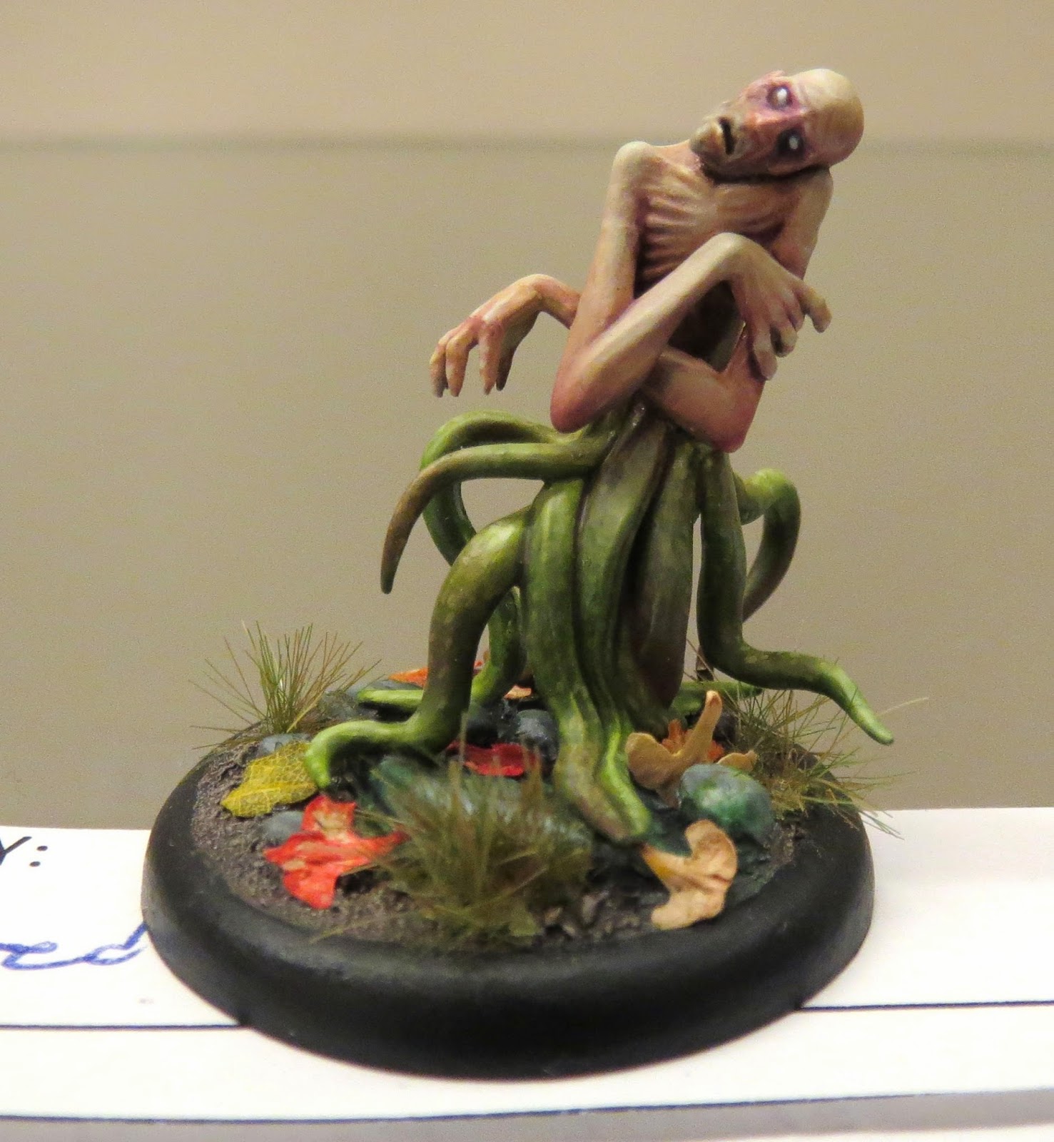
Todd McNeal entered this awesome "Malifaux Depleted".  It was one of the tiniest models in the single miniature catagory, and yet it held my attention for longer than any other.  Of course, I had the advantage of being able to pick up the model in my hands and really examine it in detail.  I did notice that many viewers from the convention didn't even pay any attention to this entry at all.

So, what kept my eyes fixated on this entry?  First of all, the skin colour is perfect.  A warmer skin tone, or a dark skin tone, would NOT have reinforced the theme of a wretched soul, deprived (perhaps of his own volition?) of sunlight.  By restricting the shading of purples and reds to the absolute minimum, while still using enough to give it depth, he let this model have a really pallid complexion.  Absolutely wonderful.  And going beyond just highlighting and shading, we have the red glazed elbows to imply abuse... perhaps from banging them on things, or even crawling on them?  The face also has precisely placed red glazing... almost like burst capillaries under the skin.  Even the subtle greys added to the face to give him the look of a 5 o'clock shadow were amazing... and again, it really reinforced the idea that this poor guy was not exactly at his best.  Even the dark bags under his eyes tell us that this is a haunted wretch that finds no restful sleep.


The beauty of this model continues with the tentacles.  In contrast to the human skin, they glisten.  The green has all sorts of different tones interplaying within it, and even some reddish contrasts in there.  The shading is spot on... I can't find fault with how this model is "lit".  There are even tiny, absolutely tiny, spots on the tentacles, which really make them look amazingly organic.

Even the transition from the "human" flesh to the green tentacles is fantastic.


I'm not a huge fan of the birch pod seed bits used as leaves on this model.  On a larger diorama, or even on a much larger base for a large model, they work fine.  However, on such a small model, they don't seem to scale as well.  Also, the red "leaves" are a touch too bright, and seem distracting.  That being said, there was one leaf on that base that wasn't a birch seed, and it looked fantastic.  You can't tell by this pic, but it was the right size, the right tone, and I think it even had the leaf veins hand-painted on.

I've been around a good long while as a painter, and while I'm not the most technically proficient painter out there, I've been trying out so many different things over the decades that my toolbox of tricks and techniques is pretty well stocked.  It's rare that I get to see a model in person where I can't place all the techniques utilized, but this one had me excited to puzzle it out and try and reverse engineer various aspects of it in my mind.  Combined with the sheer artistry involved (not just technical skill) as evidenced by the decisions that went into it, and we have a model that would be very tough to beat, in my estimation.


Gregory Schadt dropped off this striking Skorne Warlock.  Now, I'm no Hordes player (in short, I think the rules are ideally suited for hardcore tournament play, but the miniature range is not as geared to a kit-bashing hobbyist and more casual gamer like myself), but even I had to do a bit of a double-take to see a Skorne model in such non-traditional colours (aren't they normally red and gold?).

But it makes sense.  The black and white robes are more clerical / monastic in theme, while the gold still gives him that sense of richness and opulence (no vow of poverty here!).  The base also suits this theme, as it looks like he's standing in a spotlessly clean cathedral.

The metals are well done (I'm a big fan of "TMM", or "True Metallic Metals"), and so is everything else.  Purple is a good pick for the colour of the gems on his shoulders and staff as it's the direct opposing colour on the colour wheel from yellow, but giving it deeper shading would have made it pop in contrast better to all the bright gold used.  The layering of shades and highlights are done nicely, but are still pretty pronounced in places... thinner layers or blending of the layers would have helped smooth things out a bit.  Overall, a really really nice piece of work though.

So who won in this hotly contested catagory?  Well, I'm going to post pics of the 3rd, 2nd, and 1st place winners in each catagory, along with a brief bit from me, and more details from Lee De Kock's (my co-judge for this year's competition) point of view.  For anyone who does not know Lee, he's an amazingly talented painter, founder of "Beautiful Warfare" miniature painting studio, staff painter for Drake: The Dragon Wargame, and something of a painting philosopher himself.  Lee's words will follow mine, but in italics, to avoid creating any confusion.

What did he have to say about the single miniature catagory?

Hey guys 'n gals, Lee here from Beautiful Warfare with some of my thoughts going through the judging of the 2014 Gottacon painting competition. First-off, The Small Figure category. I think in general this category had the tightest margins and was the closest for poll placements, so you may find a bit more emphasis in my comments here towards the negative, precisely because the entries all displayed such a high level of skill. 


Arthur Nicholson's Kingdom Death Architect (pinup version) took third place.  Buttery smooth blending, seamless transitions, excellent NMM (although I would have liked to see the contrasts pushed a bit further), and a generally well composed paintjob really impressed the heck out of me.  Again, I had a few suggestions as to how it could have been slightly better, but there's absolutely no denying that Arthur really knows how to push paint around... his technical mastery is probably the best in the competition.  Had he addressed some of the issues I mentioned in my earlier writeup about his entry, I think it would have been really hard to beat.

The technique on this piece is fabulous, I really like the soft shading and tone. Arthur has displayed some great lighting on the figures flesh, face and even done something a lot of people seem to forget - the base! He's carried the figures shadow onto the base very well and set a tone for a light direction noticeably off the zenith. The face is painted beautifully, as is the leather and cloth, I particularly liked the hits of vivid blue in the under side of her cape, which gave a great sense of form in the lighting.

Arthurs NMM is usually fantastic, though I personally think he's done better than on this piece. While still showing seamless transitions, and a great understanding of form, I felt the metal was a bit lacking and could have used a bit more of an extreme shadow in places to really make it pop. This combined with a lack of framing on the models face (and despite her double d's) the chest looking a bit 'flat' dropped my vote for this model to third place.

I would strongly encourage Arthur to revisit this piece and emphasize some shadows here and there, to bring up the highlighting or increase the saturation on the shoulders and hair to emphasize a focal point on the face and to add a bit more depth to the white cloth.


Jeremy Fleet's Malifaux miniature had tons going for it.  His blending is nearly comparable to Arthur's (an amazing achievement!), some minor conversions, and everything about the paintjob matches the theme and tone of the sculpt perfectly.  I believe it edged Arthur's just barely... however the lighting was slightly more artfully done than Arthur's, which pushed it over the top.

I'm not sure of the name of this artist, but I genuinely love his work! This piece didn't initially grab my attention for first place, but after looking at the model with a bit more attention, I gave it my vote for first or second.

The piece as a whole displays a great global feel that ties the individual elements together extremely well. I really like the fine attention to lighting in particular. The small elements carry the same overall gradient to the zenith as the larger surfaces, and some strong understanding of colour theory was displayed through the lighting of the flesh. The individual elements use the spread of the colour wheel well to add pop and carry a tone to the lighting I very much enjoyed.

The piece also displays some fairly tight brush control in the freehand wood grain on the paddle and fine highlighting in some of the high detail areas - such as the bows on the gloves and boots. There's not too much I can suggest for improvement here, other than to maybe show a bit more care with the flocking and to add a touch of emphasis to the gem on here forehead. A few more technical elements and a touch of some metal technique would have put this piece over the top for a strong vote for first place in my books.


Finally, first place in the single miniature catagory went to Todd MacNeal's fantastic Malifaux Depleted.  I said this one would be tough to beat, didn't I?

While this model did not immediately grab my attention, I must admit that closer inspection shows a great level of skill and creativity. I think Todd did a great job in capturing all the elements of this model and really playing on them. Looking at the tentacles, I think that there is ample display of seamless transitions in the shading on the tentacles and the transition between the human flesh and tentacle flesh. The lighting on this piece is superb, with some focused lighting on the tentacles, face and rib cage, as well as solid attention to the global lighting through the zenith.

What really makes this piece shine are the small things, like the shading on the eyeballs, bags under the eyes, the 5 'o clock shadow and the effects of rotten, bruised flesh being more subtle, though continuous. What I did feel held this piece back was that the overall piece was not as strong as its individual elements. I think the piece would have benefited from a more thematic base to tie the whole piece together and an element or two that interacted with the figure, like a puddle reflecting light onto some of the lower parts of the tentacles.

In the end Kelly and I discussed the entries and decided that Todds piece displayed more technical skill and character and deserved first place for the category.

So, three absolutely fantastic, and very deserving winners.  And so, so many fantastic runners up, in my opinion.  Entering a painting competition is tough... you know you love your paintjob, but will the judges?  Well, anyone entering this competition has my respect, and my appreciation for your art.  Every entry had a story to tell, and the con-goers really loved seeing each and every one of them.

I have one or two non-GottaCon blog posts planned for my next musings, and then I'll move on to the group / unit catagory.  As always, your comments and input are welcome.

Thursday, 20 March 2014

Vancouver Master Class: Painting Lessons with Meg Maples

I just heard some fantastic news: Meg Maples (former Privateer Press studio painter... if you've ever ooh'ed and aah'ed over a pic of a Warmachine or Hordes miniature on the PP website or in their magazine, it's a good chance you were drooling over Meg's incredible painting) is coming to Vancouver on the weekend of May 10th and 11th of this year.

A stunning piece recently done by Meg

Meg lives just across the border, in the Starbucks capitol of the world, Seattle.  With almost as many Starbucks locations saturating the streets of Vancouver, and comparable rainfall, it was relatively easy to convince her to make the 3 hour trip (if the border lineup is good) to show us Canucks how to paint.  Now, we've got some decent talent up here, but I suspect that the level of painting locally is going to improve exponentially after her class.  We saw this happen when Mathieu Fontaine visited Vancouver to teach, and it's bound to happen again thanks to Meg.

While it's true that painters nowadays have many more avenues open to them in terms of learning material than we ever have (trust me, I first started painting back in the dark ages of the late '80s... I should know), in the form of painting articles in multiple magazine offerings (both in print and online versions), blogs, Youtube, various DVDs, books, and on online forums, I still believe the best way to learn painting is the old fashioned way... with a real flesh and blood teacher.

There's just something about having someone right there, passionately explaining things, demonstrating techniques, answering questions, and showing off and detailing their own works in person, that really inspires a budding artist.  It's almost as if you learn something just by being in the same room as someone that talented.  Getting a chance to sit down and paint under direct tutelage of an accomplished painter and excellent teacher is a rare opportunity that can't be taken for granted.

In comparison, learning miniature painting from something you read is akin to a science experiment, or learning how to make a dish by reading a cookbook, or doing surgery based on a chapter in a textbook.  You are essentially trying to replicate a result by following a formula laid down in words and pictures.  It's a dry process.  Sure, you can still learn a huge amount by reading, but only if the writer was really good at explaining how the procedure works, and your understanding of the underlying principals involved and the foundational techniques is solid.

DVD's have also been a challenge for me.  I've got a small collection of painting DVD's, albeit slightly older ones.  While the resolution and video quality is much better than YouTube (which helps immensely... it sucks watching some grainy, poorly lit, and shaky video on YouTube), the DVD's I've watched did a poor job of actually showing how a master painter actually paints.  One DVD I own only showed the painters hands, and the model she was working on... it never went to the palatte (thus, I couldn't see how she manipulated the paints before applying them to the model), and the narration was sparse, and the explanation of the painting process very limited.  I've heard that there are some excellent DVD's out there now, but I haven't wanted to gamble any more of my money (or time) on them yet.  Maybe in the future though.

Painting with a teacher, even in a larger classroom setting, is something else entirely.  If the students are respectful and enthusiastic, and the instructor is both good as a teacher and painter, then magic happens.  Being around other painters that are getting excited with new techniques and tools is electrically invigorating.  Hearing "war stories" from a master painter that knows the history of various painting schools of thought because that person was actually a part of painting history is absolutely awesome.  It's just the thing to break any painting slump you are in, and get you off the comfortable painting plateau you were currently on, in order to reach new heights in your painting skill.  This was certainly the case for me after taking Mathieu Fontaine's Master Class in Vancouver... before the class, I was completely burnt out on painting minis, and completely set in my old ways of painting.  Afterwards, I was totally reinvigorated, and trying out new things fearlessly.

The venue has been set (the Eagle's Club in North Vancouver) thanks to the hard work of Andrew Meermed and the Chop gaming club.  Meg is coming up with a list of supplies to bring, but has advised that students get their hands on some high quality Kolinsky sable brushes (Windsor and Newton Series 7 or Raphael 8404's are the ones that come to mind) in slightly larger sizes than usual (size 1, 2, perhaps 3?) in order to work on some two-brush blending.  Payment will be in advance (Meg will likely post details on her "Arcane Paintworks" Facebook page).  The only complication may be that because May 11th is Mother's Day in Canada, some of us will have to work around that somehow (I may have to miss the Sunday class, and just attend the Saturday).

 I can't stress enough how rare an opportunity this is.  For years, I have been absolutely jealous of my European friends.  There is such a concentration of master level painters over there, and there are many many more events and classes within driving distance for them.  North America is a very big place though, and top class painters are spread pretty thin.  I urge people within easy travel of Vancouver to at least try and make this class.  It'll be well worth it.

Sunday, 9 March 2014

GottaCon 2014 part 3 : Single Miniature continued

Returning to the Single Miniature catagory, I'd like to take the opportunity to remind people to (re)read my previous blog post : Explanation of Judging Process for Painting Competitions.  Written after last year's GottaCon painting competition, I think that everything I wrote there still rings true.

And without further ado, here are some more entries in the 2014 GottaCon Miniature Painting Competition.


Ric Jesson entered this amazing Twilight Knight pinup model.  I have to admit, I wasn't prepared to see two Kingdom Death models in this year's painting competition (Arthur Nicholson's pinup Architect was the other one).  As far as I know, no one ever uses these models for gaming... the main draw of this line of miniatures is their gorgeous gothic art appeal.  When I saw these models in the competition, I knew things were getting serious... these weren't going to be simply game-quality paintjobs plucked from someone's army, but dedicated competition pieces.

The Twilight Knight model in particular is one of Kingdom Death's signature pieces.  A quick search in Coolminiornot reveals that there are a ton of them painted by some of the finest painters in the world.  That being said, I almost didn't recognize Ric's base model, as a simple arm swap and intriguing base completely transformed the silhouette of the piece.  There is some coverage of his work on his blog, Ricalopia.

The flesh was particularly well done, and I could tell plenty of attention was lavished on getting her skin tones right.  By contrast, the highlighting in other places was a tiny bit heavy handed.  The armour plates on her knees, and the black tiles showed only a few layers of highlighting, and the opacity of each layer was a bit too strong.  When using a layering technique for shading and highlighting, I believe people should thin down their paints to a near translucent opacity.  It means that many more layers of highlighting are required to achieve a solid contrast, but since it makes for a really gentle and smooth transition between shades, it can deceive the eye into believing that there is a really nice blending job going on.  The master of this technique was a guy out of New York in the late '90s and early 2000's named Bobby Wong:


This Ultramarine won bronze at the U.S. Golden Demons in 2001.  From what I've been told, Bobby would decide on a colour, find the darkest and lightest tones he would use for that particular colour, and then proceed to line up a bunch of empty paint pots and mix up every shade he could manage between those two extremes.  By meticulously laying down each layer one at a time, spacing each layer out precisely, he would achieve a nearly imperceptible succession of coloured layers, and his transitions were nearly invisible to the eye.  If this story is true, then Bobby was not so much an artist, as a painting machine.  By laying down countless layers of paint, he was the human equivalent to a 3D printer, if such a machine could be taught to paint.  It must have been insanely time-consuming, but the results speak for themselves.  It reminds me of how last year's winner, Bryce Jensen, paints his models, but taken to an extreme.  It's not my favourite method of painting (it doesn't take as much "feel" for the brush, paints, and model, and hence it's too cold and methodical for my tastes), but it gets the job done.

However, Ric needn't have gone to that extreme.  Had he feathered the edges of each layer a bit, I think it would have ended up looking much smoother.  In any case, there were a few areas that didn't live up to the skill level and dedication that he showed to the flesh areas (which were really nice, btw).


Emily Jarrett's "Paladin of the Wall" was another solid entry.  She literally painted this model during my painting clinic on Saturday, and I had the pleasure of spending some time chatting with her about various topics, including things that had absolutely nothing to do with painting (she told me that she was a professional theologian, and it was interesting hearing her take on theology in gaming).  I did my best to hold up my end of the conversation, but being sleep deprived, caffeine deprived (the engine of my brain runs on caffeine), and battling the first signs of a cold, I could only muster the IQ of a flickering fluorescent bulb with a loose connection.  At the end of the day, just before entry deadline cutoff, she decided it was done, and asked if she could enter it in the competition.

This model's bone coloured armour was strong and even, and lacked the kind of rough brush marks that one typically sees in any white-ish coloured paint.  For some reason, I've found most whites and cream colours are somewhat gritty (Vallejo Model Colour is typically the worst for that, but all paint ranges I've tried suffer from this to some degree or another), but if you thin down your paint enough (as Emily did), and have enough patience to lay down multiple thin coats (while allowing each coat to fully dry inbetween), you can end up with a fairly smooth white, which Emily did very well.

What I wish I had recommended (and demonstrated) to her was the use of washes for blacklining.  The whites, golds, and silvers on her model needed more definition from one another, and a bit of blacklining would have helped with that.  By mixing a little bit of dark coloured ink or GW wash with a bit of medium (such as GW Lahmian medium, Vallejo Matt Medium, or even a 90% water to 10% flow release mix), and then carefully applying this to precisely the areas you want (such as the border between the gold and steel areas of her sword, or around rivets), you can create nice visual borders on the model that make it much more easily read by the human eye.

Not having enough of a real defining border on a painted miniature reminds me of the colour-only sheet of cel animation, as compared to the final product.  I had a very hard time finding any examples to show you via my weak Google-fu.


In this pic, you can sort of see what I'm talking about.  The colours are there, but without a defining line between them, they don't contrast well against one another.  Your brain naturally wants to blend the colours together.


This is a better example.  This is a comic book cover, without the characteristic black lining of comic book art.  It looks like a washed out watercolour.  It leaves a fairly weak impression on the eye, and in the brain.


Now look at this finished product, where the original line art has been reinforced with the work of a good inker.  That would have been a dramatic black and white piece, but then the above example of colour was put in, and this is the final marriage of dark lines and bright colours.  It has that visual punch that the earlier colour-only pic lacked.  It has much more depth to the piece, as well.  Hard to believe that the earlier piece was exactly the same work, minus the black lines.  The black lines give the impression of deeper shading to the blues, the flesh tones, the hair, and everything else.  That illusion of deeper shading gives the pic more depth, and makes the whole thing much easier for your eye to read.

On Emily's piece, the cloak has fantastic depth (although an extra level of highlighting would have been welcome).  So does some of the gold areas, where it looks like some sort of wash was applied.  But the bone coloured armour plates and the steel of the sword could have used a blackline wash to visually reinforce them, and make all the details pop so much more.


Kim Daynes entered this fantastic limited edition model from Privateer Press.  Last year, she entered a "Druid Gone Wilder" model that really impressed with it's fun flair.  Her entry this year was a bit more subdued in tone, but just as jovial in theme ("Hey, look who brought the beer!").

Again, Kim really "brought it" with the base.  The rising cliff face was neat, and the use of static grass clumps was perfect.  Unlike the old days, when we dabbed white glue onto a base, and then pressed finger-pinches of loose static grass them, we now have pre-made clumps of grass for sale in various gaming shops (Army Painter offers a "Highland Tuft" that I really like).

I also love the fact that the pilot really stands out from the rest of the model.  Your eye is naturally drawn to her first, and can then take in the rest of the surrounding detail afterwards.  The pilot is a real focal point of this model, as it was no doubt originally intended by the sculptor.

She also had depth aplenty on this model.  Shading was great, but I would have liked to see her take her highlighting up another notch or so.  With the green armour plating in particular, some lightened edges would have simulated the way light tends to catch on the edge of a plate.  One of my favourite painters, Angel Giraldez, is particularly good at painting mecha, and any of his models are a good example of what I'm talking about:


By brightening up the edges, you create contrast.  If this model was full size (let's say, 10 feet tall, perhaps?), then the sun's light would naturally catch along the edges of the various blocks and plates.  This light also creates contrast against the dark shaded areas that they border against.

Kim's model was a huge improvement over last year's entry in terms of depth, but I feel like it almost went too far... it became a bit desaturated and lost some vibrancy.  By bringing the highlights up a notch or two as well, she could have created a much more interesting and eye-catching contrast.

I guess I'll close up this blog here, as it's again past my bed-time (this time made worse by darn daylight savings time... grumble grumble grumble).  Sorry for only covering a few entries this time, but these ones were really great painting topic starters, and I hope I was able to illustrate some points for people to consider.  Overall, I believe these entries were great paintjobs, and each had some sterling high points for me.  I only bring up some odd points here and there as places of potential improvement, which is something I look for every time I myself enter a painting competition.  I do my best to emphasize my strengths, and each time I do up a new model, I try and work on my weaknesses.  In doing so, I hope to become a better painter in the end.

Friday, 7 March 2014

GottaCon 2014 part 2: Single Miniature Catagory

Let's start the GottaCon 2014 coverage with the Single Miniature Catagory.  In my experience, this catagory often gets the least amount of attention during the event, and the most attention after the fact.  Why?  For a few simple reasons.

As far as each entry's footprint goes, these are the smallest entries when viewed in person.  A single miniature occupies a relatively tiny base, and sometimes the model itself is only about an inch tall.  There are larger models within the single miniature catagory (ones mounted on steeds, typically), but anything larger would be considered for the large model catagory.  

*Side note: We're considering making a template for next year and keeping it on hand at the entry table, in order to eliminate any confusion.  If your entry cannot fit within the single miniature template, then it must be entered into the large model catagory.  And since each participant can only enter a maximum of one entry per catagory, it may mean that you would have to choose between your intended single miniature entry (that happened to be too big) and your intended large model entry, as your sole entry for the large model catagory.

Since these entries are the smallest of the three catagories, they require the viewing public to get pretty darn close to the cases to discern the level of work that went into each one.  As many people don't bother to get that close, or perhaps don't have the sharpest eyesight (I certainly don't... hence my increasing reliance on an optivisor for judging), the single models are often the most overlooked.  Not only that, but when people come check out which ones actually won, they are often suprised by the judge's decisions.

Of course, with the wonders of digital photography, the Internet, and giant size monitors, the amount of detail crammed into these tiny models becomes more easily apparent after the event is over.  Certain elements pop, and subtleties can be better appreciated.

Single model catagories are also usually the most heavily contested.  After all, EVERYONE has a bunch of single models painted up.  They might not have a cohesive unit of painted models, or they may not have taken the time to paint up a large model like a dragon or tank, but everyone has a few individual models painted up that they are proud of.

So while the large models often get the lions share of Con-goers attention ("Ooh, look!  A big dragon / stompy robot!  How cool!"), followed by units, single miniatures take a more discerning eye to really appreciate, and to stand out from the hordes of other single miniatures.

Well, let's get into it, why don't we?


Arthur Nicholson's stunning Kingdom Death Architect model (pinup version).  This model was a textbook definition of "overlooked".  In the case, this petite miniature didn't have any features that really made it stand out (other than the, uh, um... what was I talking about again?).  No fiery daemonic steed, no huge banner, no huge guns (although Austin Powers fans might beg to differ), and no crazy, over-the-top base.  Just an amazing job of buttery smooth blending, plenty of contrast, and Arthur's trademark impeccable brushwork.  His technical proficiency is astounding.  Have a look at her backside... er... I mean, the back of the model:


The highlights and shading on the skin is absolutely seamless.  No rough spots, no visible brushstrokes, no Playboy magazine style airbrushing either.  Just a deft hand with the brush, and an ungodly ability to blend paints.  This can also be witnessed on the weapon she carries.  Unless you zoom in really close, you can't discern the layers of blending at all (and remember, the model is only about an inch tall in real life... many times smaller than what you're seeing on screen).

That being said, I can't say that this model was perfect.  For one, the face was darker than the rest of the model's skin.  That's something of a big faux pas in miniature painting, and in other kinds of art as well.  In real life, our brains are somehow hard-wired to gravitate to people's faces... it's usually the fastest way to recognize people.  In order to simulate this effect on a 2d art piece, or a 3d miniature, we have to brighten up the face in comparison to the rest of the model.  By doing so, you draw the eyes to your subject's eyes and face, and then it can wander out from there.

Another thing to consider is that the face is the first place our eyes want to look at in order to determine the mood of the model.  Facial expressions convey emotion and tone better than anything else, and so naturally, we need to find the face first in order to understand the rest of the model.

In old school cartoon art, they used to exaggerate the head size quite a bit, as they didn't have sophisticated enough printing technology to make the face brighter (in fact, it was often only in black and white print):


And in fantasy art, the composition and lighting of a piece is designed in such a way as to draw the viewer's eye toward the face first:


And after watching a "behind the scenes" documentary of the filming of Lord of the Rings, I realized that even in movies, lighting is done to emphasize an actor's face, both during filming, and in post-production:


Okay, so that last one wasn't in keeping with the pin-up theme (unless you have a thing for hobbits and wizards).  But you get the idea.  

Lastly, I would also have liked to see a bit more done with the base.  Nothing over the top to distract the viewer from model itself, but a little more weathering, perhaps a teeny bit of vegetation, and perhaps some grime on the stone (ever notice how old stone and concrete always seems to have a thin sheen of green slime creeping up the side of it?) would have made the base look a bit less sterile. 


Craig Fleming's Saurus Warrior on Cold One (or as he titled the piece, "Lizard riding a lizard").  This was also a pretty great piece, and was pretty ambitious.  Great blends on the metal arm (plenty of contrast, but could have used a touch of blacklining and a little hit of edge highlighting simulating a glint of light to really make it pop), fantastic gleaming effect on the spear blade (notice how the dark areas meet up with the light areas on the opposite sloping side of the blade... that's the key to maximum contrast, and contrast is key to implied metallic shine), a nicely detailed base, and nice looking bone effects.

There's something about this model that looks clunky to me though.  Perhaps it's the fact that the rider has about the same mass as the mount (no fault of the painter though, but nonetheless, picking a good piece to work on is a strong component of a successful painting contest entry), or perhaps it's because the rider and mount are fairly similar in colour and tone (using a complementary or contrasting colour scheme for the two would have visually separated them better).  Compounding the last sin is the colours of the base... they also sit around the same colour spectrum.  Up close, the model is fantastic.  From arm's length, details get a bit muddled.

Excellent work overall though.


Ryan McKinnon's "Southlands Ogre" is a solid entry, with some really neat details.  The dark skin is well executed, and fits the theme of the model nicely.  So does the crackle effect on the base (dry, parched ground), and the bright tattoos / warpaint.  The brightness of the markings are a bit uniform though... the fact that it's the same brightness of yellow and orange used on the zenith of the model (the top of the head and shoulders, where the sun's light would hit brightest) as the more shaded areas (under his shoulders and in the shadow of his "moobs") dispels any illusion of scale.  However, I also really liked the verdigris effect on the bronze bits... it gives the metal parts a weathered look.

This is a great gaming piece, but a few extra minutes of work could have elevated it into a more serious competition level.  The bronze could have used some more highlighting... even aged metal reflects a bit more light than this... a hint of a shiny glint here and there would have added extra interest.  There is also only two tones of colour on the upper part of the footwear... I grant you that feet are hardly my favourite parts of a model either, and I tend to rush things a bit there too, but two tones is fairly flat.  The skin could have used one more level of highlighting as well... nothing drastic, just a really restrained touch of a slightly lighter tone where the light would catch a bit more (tip of the nose, edge of the eyebrows, top of the head, off the points of his knuckles, etc).

Still, this model had plenty of character, and the more I look at it, the more things I find that I like.  The highlighting of his facial hair is spot on, the trousers are nicely done, the teeth are particularly well shaded and highlighted too.  Great work.


Gordon Henderson's "Battle Nun" had pop aplenty.  The bright red robe, contrasted against the vibrant green base, made this model really stand out from it's competitors.  The black shoes don't get lost in the raised foliage of the base, and grey / silver metallics give the model a decent amount of negative space, keeping things nice and simple.

Gordon could probably thin his paints a bit more though.  Multiple coats of thinned down paint would make the model look a bit smoother.  Also, a bit of blacklining would help define each area from one another... there's no discernible border between his reds and his whites, for example.  A touch of blacklining would have helped around the eyes as well.  Some deeper shading on the reds of her clothing would have helped define the creases and folds of the cloth too.

But Gordon's colour selection, and more importantly, his colour placement, was impeccable.  I can tell that his technique will improve in time, but there's every indication of a good artistic eye in this model.


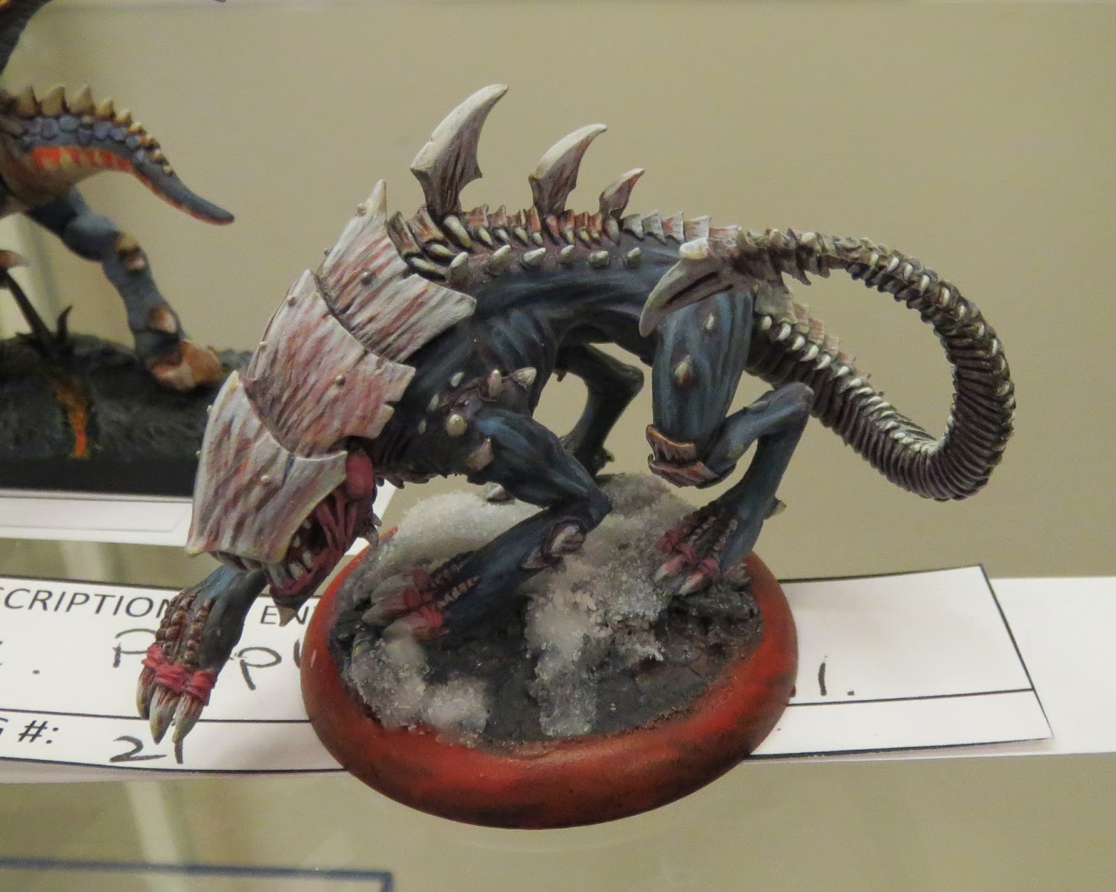
David Brereton's "Raek" was a dynamic entry in the single model catagory.  The flesh coloured undertones / streaks in the chitin really give it an organic feel.  His highlight placement was also good, although the brushstroke highlighting is a bit heavy handed.  I get that it gives off a striated muscle impression, but it's a "quick and dirty" technique... it gets the job done, but it's not all that elegant.  On the other hand, the model itself does not have particularly well defined muscles, so this may have been a conscious effort on David's part to make up for the shallow detail of the sculpt itself.

Nice touch with the use of crushed glass as snow.  I've used the stuff myself (Secret Weapon Miniatures offers a particularly great set that I like), and there's certainly a bit of a learning curve involved.  It has a gorgeous sparkle that other kinds of fake snow don't offer, but getting the right consistency takes practice, and the stuff is hazardous to use if you don't take precautions (a dust mask keeps you from inhaling glass particles, and latex gloves keeps the stuff from working it's way into your skin and under your nails).  I think David might have tried applying the stuff all in one go... it came off as chunky slush, rather than fallen or disturbed snow.  Perhaps thinning the stuff down with more water effects, and building it up in thin stages (letting each layer dry before adding the next) would have been better.

Overall, a great piece.  Powerful and aggressive in tone, but it could have used slightly more refined techniques for my tastes.


Apologies to Rob Howell for the particularly bad photo of his Trollblood Solo.  All these pics were taken by my humble little compact Canon Elph (I simply didn't have the space in my gear bag to carry all my painting clinic supplies AND a full size DSLR and specialized lighting), and the poor little thing just had a horrific time trying to capture this particular model.

But bad photography aside, there was nothing horrific about this model.  Skin tones were awesome, colour selection was great (the subdued tones in her clothing really made her turquoise skin pop in contrast), and the extra details in the base were really nice.  The face, chest, and shoulders were the main attraction though... really smooth highlighting and shading added to the realism, and the lighting was done well too.  The rest of the model could have used an extra layer of highlighting to really help define the details though... Rob really got the foundational highlights and shading down well, but an edge highlight here and there would have given them a crisp finish that would have made everything stand out better, and help the viewer's eye read the model.  The brown leather straps in particular could have used one or two more levels of highlighting... perhaps mixing in a touch of bone paint into the brown would have simulated the reflection of light a bit.  Even the metal areas could have used a touch of edge highlighting to give the impression of light glinting off a shiny surface.

Overall, I can say that this paintjob was definately headed in the right direction.  However, it seemed to stop just shy of it's final destination.

I'm going to pack it in for tonight (gotta get up early to coach my kid's soccer game tomorrow morning).  I've got several more entries to cover in just the Single Miniature catagory, and then on to the large model catagory and the group / unit catagory.  Keep checking back, and as always, comments are always welcome.