Monday, 11 November 2013

IPMS Vancouver : Fall 2013 Show / Part I

Back to the world of blogging!!  Apologies for the long hiatus, but I got quite a bit of painting and event reporting done during that time, so I hope to make it up to you guys with some quality posts over the next little while.

Yes, I got a decent amount of painting done (relative to my usual slug-like pace), but I had a fair bit of motivation.  Aside from a well attended in-store contest run at my local Games Workshop store, the annual local painting competition, The Immortal Brush hosted by Strategies Games, was coming around again, and I always make a point of getting in a few entries every year.  Second of all, I was planning on attending my very first IPMS event here in Vancouver, the big Fall show.

For those who have never heard of IPMS, it's a huge international organization (a network, really) of dedicated modellers.  For many people, IPMS is "them".  While "We" are the sci-fi and fantasy geeks, "They" are the die-hard historicals.  "We" measure the scale of our models in millimetres (as in "25mm", "28mm", and "32mm" scale), while "They" use fractions starting with the number 1 (ie "1/5th scale", "1/48th scale", "1/35th scale", etc.).  "We" read Michael Moorcock and Tolkien, and watch Star Wars, Starship Troopers, and Game of Thrones.  "They" read "Enemy at the Gates", and watch "A Bridge Too Far".

Wow... that's a lot of quotation marks.  Phew.

The fact of the matter is, the IPMS'ers are pretty much like us.  They love to build and paint models.  The differences are actually quite minor.  The most fundamental difference, to me, is that for us, the hobby originated out of wargaming and grew into a modelling art form, while for them, modelling was it's own hobby and art form right from the start.

The other main difference is the brands of kits we build.  Instead of seeing names like Games Workshop, Privateer Press, Rackham, Hasslefree, and the like, names like Revell, Tamiya, Airfix, etc., were the norm.

So, stepping into an IPMS event was a bit of a step out of my comfort zone.  Not a HUGE step, mind you (like I said, it's all modelling, after all), but I suspect it would be somewhat like how a muscle car fanatic would feel like when attending an import tuner car show.  Put aside any snobbery or preconceptions, try and have an open mind, and try and make some new friends.  Most importantly, my mission was to see some gorgeous models, puzzle out how things were done differently, see things from a new perspective, and see what I could take back to my own miniature building and painting.

Lest anyone think that I am trying to take any credit for being the first person to try and cross-pollinate the two species of miniature modelling genres, let me admit that it's definately NOT new ground for some of the real "Masters" out there.  I was introduced to the concept by Mathieu Fontaine,(sure, I've picked up the odd "Fine Scale Modeller" magazine and books on dioramas by Sheperd Paine before, but never really put anything into actual practice before meeting Mathieu).  Since then, I've come to admire the works of Justin McCoy of Secret Weapon Miniatures (co-incidentally a member of IPMS), and really took notice of a certain entry in the last GottaCon Painting Competition (see Gerald Moore's award-winning entry here).  Heck, I bet many of the stunning paintjobs by the staff painters at Forgeworld owe a great deal to previous experience with a Revell or Airfix model.

In any case, I was also kind of curious to see how some of my own works would be received by this crowd.  To that end, I brought along some models I had worked on in the past, some of which had won awards in various miniature painting competitions.  With all the entries being displayed openly, for all attendees to inspect in person and up close, it was going to be interesting to watch perfect strangers' reactions to my entries.

Well, I've rambled on for long enough, and I haven't posted any pics just yet.  If a picture is truly worth a thousand words, then it's time to get really wordy:


The event was held at the Bonsor Recreation Centre, and was spread out across three large rooms.  This was the main attraction: the competition entries.  I showed up early, dropped off my entries (it took awhile to figure out what categories they all fit in with the help of some really friendly staff), and then started walking around and checking things out.


There was a definite increase in attendees once the deadline for entry registration had passed.  The tables were now full of amazing models, and there were clumps of oglers and some really interesting discussions going on.  One thing that was readily apparent was just how respectful everyone was.  While people were intensely passionate about modelling, they were also really chummy with each other, and somewhat laid back in demeanor.  Not once did I hear anything disparaging said about anyone's entry (which sometimes happens at some of the miniature painting competitions I've attended in the past).


This room was full of vendors hawking their wares.  Plenty of business was going on here, and again, the vibe was very chill and super friendly.  I can't say that I was tempted by all the kits on sale (battleship Bismarck models as big as my 5 year old kid?  No thanks... I can barely finish a tiny Rhino APC in a year), but I did pick up a really nice 1/35th scale resin figure of a modern US Army soldier for $16.  There's no way I will ever be able to paint up a realistic ACU digi-cam pattern or even MultiCam pattern on him, but perhaps I can paint him up as a black-clad police ERT member after putting in some serious conversions.  If you ever plan on attending an IPMS event, be sure to bring lots of cash.

There was also a third room, which I unfortunately did not take any pics of.  In it, there were a number of tables set up for kids to build and paint models (which were provided!), and also a number of tables set up by the local monster kit building club, where one could check out the painters in action, ask questions, and ogle some amazing monster busts (and by "bust", I mean a large scale model of a figure's head, chest, and sometimes arms... not just the chest...).  Again, really friendly and enthusiastic vibe.

 While I didn't take any pics of the room, I did manage to take pics of some of the kits:


Fantastic skin... the purple tones around the eyes in particular, and even the hints of blood vessels under the skin.  When viewed up close and in person, you can really sense that there are layers and layers of depth to the skin, just like on real flesh.


Zombies... I love zombies (although I prefer to keep them at long range).  Again, the skin is fantastic, but the glossy eye and teeth really put this over the top.  Grotesquely gorgeous.


Check out the eyes and lips!  Wow.

Anyway, back to the main room to check out some of this year's competition entries:


This pic was taken of the sci-fi and "what-if" catagories, early in the day.  By the time entry cut-off came around, this table was packed, and the entries had expanded onto another table.  My Inquisition Rhino looked a bit out of place next to the Snow Speeders, Tie Fighters, Foxbats, and various space stations, mainly because it wasn't a theme that was readily recognized by mainstream sci-fi fans, and because it was a very vibrant and saturated colour when compared to all the whites, blacks, and greys.


By contrast, the "Mecha" category was definitely pretty thin in terms of entries, with only my Khador Warjack and this absolutely monstrous Robotech mech in attendance.  Most of the mecha were well represented over on the Gundam table.  Apparently the local Gundam scene has happily tucked themselves under the IPMS umbrella, and while the Gundam guys were a distinct sub-culture here, they seemed really stoked to be there.

Speaking of Gundam:


Again, early in the day.  Later, there were almost double this number of entries on the Gundam table.  They were practically shoulder-to-shoulder.


A closer look at this particular kit.  Subtle but effective weathering.  One thing I've noticed with Gundam is that weathering is not really their thing.  There is a good use of it here and there, but it's really really subtle and slight.  Most entries had little to no weathering at all, and to my un-educated eye, they just looked like stock vinyl kits right out of the box.  If I was to make a guess as to why people liked that style, it would be that perhaps they were trying to recreate that '80s / '90s TV cartoon anime look.  Clean was what the subject matter looked like on TV, so that's what they should look like in 3D.  Again, just a wild guess, and it's something I think I should look in to.


Over on another table, there were a long line of Gundams that were not competition entries.  From what I gather, it was some sort of mobile Gundam museum, with each Gundam standing next to a info card detailing that war machine's armament and service record in various fictional conflicts.  Without exception, each and every one was done to an amazing standard.


Something about the weathering on this model really gives it depth.  I've seen this kind of painting done on various airplane kits, where the lines are pre-shaded with an airbrush, and then the basecoat goes on over top.  Again, this is something I'm really very curious about, and I definitely want to learn more about this.


A closer look at what I mean.  Each armour panel / segment is made distinct from the next by a hard black line, but also with a much more subtle and soft grey-tone.  Is this to represent a slight build-up of grime?  Strangely effective at lending depth to an otherwise flat model... a vastly different approach to armour than the Mig Jimenez technique of colour modulation that I've been trying out for the last year or two.

Again, very reminiscent of what I've seen on some airplane kits:


"Highway to the... Danger Zone!!"

Sorry, I couldn't help myself, even if this isn't an F-14 Tomcat.  While there were at least one or two of those at the show, I liked this model because of how well it scaled... which is to say that it looks like a much bigger kit in pics than it really was in person.  Effective use of shading was key to achieving this.


A close-up of the tail.  I'm guessing an oil wash with a subtle feathering with thinner helped make the effect of greasy oil buildup inbetween the panels possible.  I've been to the Langley Air Museum, at the Abbotsford Air Show, and on the deck of a real-life aircraft carrier, and seen planes like this up close.  This really gave me the feel of how the rivets would exhibit a nice brown / red patina of oil and rust.  Lovely.  Really lovely.


This one's a bit different, and not just because of the different time period.  I really liked how the effect of paint flaking and chipping off the aluminum (was it aluminum on the real plane?) body was achieved.  The cockpit glass is also crazed and frosted nicely too.  I would have liked to see a tiny bit more shading in places to give it a greater sense of scale, but otherwise I really really like this model.

Anyway, that's enough for one massive blogging session (these things take WAY longer to put together and type up than it does to read through and view pics).  I'll be back shortly with part 2 of this 2013 IPMS Vancouver Fall Show.  I've only just scratched the surface, and will have tons more pics to show you (tanks, dioramas, figures, and battleships, oh my!), along with my thoughts and impressions .  I will also show a few pics of the models that I entered, and let you know how they fared.  Plus, if I have time, I will give you a short write-up of tips and advice I'd give someone who was attending their first event of this nature (from a person who just attended HIS first event of this nature... heheh).

I've also got some pics of some other events I've attended recently, and pics of some models that I recently finished, and others of models I'm still working on for future blog entries.  Stay tuned, and be sure to comment!

Tuesday, 27 August 2013

Sources of Inspiration : Concept Art

As you know, no artist exists in a vacuum.  Only God came up with something from nothing ("Let there be LIGHT!!!"), and since then, every artist has basically been coming up with their own creative spin on things based on their own influences and experiences.  So, when you are trying to come up with something "fresh", and "original"... something to capture your audience's attention and elicit a chorus of "oohs" and "aahs", where do you go for inspiration?

Personally, I go outside the hobby for a different perspective.  Much of what we see in miniature art is recycled... painters are replicating other people's work over and over again, with only the slightest variation due to working with the same model kits, the same tools, the same techniques, the same game background, etc.  Of course each will be at least a little bit different... we all have our own unique "fingerprint" when we build and paint miniatures.  However, the most exciting moments in miniature art come from an infusion of fresh DNA... otherwise (creatively speaking) we are constantly cross-pollinating from the same gene pool.  We need to stop the cycle of interbreeding ideas, and start checking out what's going on in the wider art world.

Some go to written fiction, and try and realize a concept or scene that has never been attempted in 3D before (example: Forgeworld's Loken and Abbadon battling it out).  There are countless examples of popular characters made into miniatures.  At other times, even a short blurb or piece of inconsequential filler background can inspire someone to start a project based on that creative seed.  My own Warmachine Khador army was themed on a stray sentence in the very first Warmachine rulebook... something about The Butcher of Khardov's retinue being called "The Dragon" something-or-other (I'd have to dig up my old WM 1st ed book out of storage to recall exactly what it was).  I was compelled to work a dragon theme into the paint schemes:


Others go to 2D art published by the same manufacturer of the model range their are working with (example: Raphael Garcia's excellent Crimson Fists diorama).  Both are excellent sources and great "go-to" places when you need an idea for your next project.

The original inspiration: 40K 1st ed rulebook cover (Rogue Trader)

Which led to this more recent Dave Gallagher version


And finally realized in 3D, thanks to Raphael Garcia!


However, when I need some ideas for odd conversions, sculpting projects, terrain pieces, etc., I love to check out concept art.

Most of you are already familiar with the idea of concept art.  For those who aren't, here's a quick and dirty explanation:

When the director(s) of a movie, video game, or other visual medium need to populate their project with brand new characters, vehicles, scenery, monsters, etc., they hire concept artists.  These artists work with the description or synopsis handed to them, try and envision the context in which those things "exist", and then sketch out various versions of that idea to present to the director.  The director views them, sends some feedback back to concept artist, and they then work to fine-tune the idea into the final project (and from there it goes to the digital artists, animators, costume designers, set decorators, props builders, etc.).

Concept Artist Matt Rhodes explained the thought and creative process on his blog (http://mattrhodesart.blogspot.ca/) recently:

"The role of a Concept Artist is the role of an explorer, tasked with charting a world without sunlight. Bear with me here:

You start off with your reference and research. These are well established base camps. They’re well lit, highly populated and safe. The better your reference the better your bearings will be. The artist’s job is to start at base camp with a bag of torches and run furiously out into the darkness. Every doodle, sketch, painting and storyboard is a torch lit somewhere out in the black. You mostly find weeds and rocks out there. But if you keep pushing you sometimes find a rich landscape that can hopefully become a new basecamp"

Adam Adamowicz (one of the brilliant concept artists... possibly the main concept artist... behind the computer games Fallout 3 and Skyrim) said something very similar, but in a very different manner:

"Visualizing all of the aspects of a make believe world is quite an educational experience. On any given day I could be simultaneously learning about multiple topics, from motorcycle engines to 50’s fashion design. It’s kind of like writing and filming a National Geographic documentary film for an actual sci-fi world. For this job, I think the more you read on a wide variety of subjects, the better equipped you are to create depth and realism, especially for a fantasy setting. The fantastic that’s grounded in real world elements and then elaborated and exaggerated upon, seem to work the best, and create a solid jumping off point. This often creates fertile ground for generating additional story elements that can influence costumes, machines, and even motives for the various personalities inhabiting a made up world."

I find it amusing that these highly creative, highly intelligent people are, in essence, professional "doodlers".  I remember getting into lots of trouble from my teachers and parents for doing just that as a child.  My math, english, french, science, and social studies notebooks were full of half-realized sketches of all sorts.  However, what sets them apart from my juvenile self was their sense of purpose and direction, and just how well their "base camp" is stocked with reference and research material and knowledge.  

So what does that mean for us, the miniature painter?  What can we take from the realm of the concept artist?

I think the most important thing to learn from them is how they approach a project.  When they start, they have a sense of what they want (albeit a pretty vague idea sometimes).  They then educate themselves on the topic by doing some research, and collect plenty of reference materials.  Thus armed, the concept artist can then extrapolate from that... feeling out different takes on the subject in sketches, paintings, sculpts, and 3D renders.  They can then lean back, look over what they've come up with, perhaps get some feedback, discard what doesn't work, and keep repeating until they've nailed the final proposal (the blueprint with which the costume designers, set decorators, animators, sculptors, etc., will work with).

We do the same thing.  At the most basic level, even the 12 year old gamer will see something that inspires them, read up on the background and view the art related to that model or army, figure out what techniques will help them finish the project (often by trial and error), and "have-at-er" until they have something to show off.

The professionals within the miniature industry work in similar fashion as well.  For example, Matt Wilson, the founder and visionary behind the Warmachine / Hordes Iron Kingdoms world and owner of Privateer Press, turns out some astounding concept art that the PP sculptors then turn into gorgeous models, which then get painted up by their top-notch painters for use in promoting their products.  He may not know how to build a steam engine or robot by himself, but I'm pretty sure he understands the concepts.  It's my guess that he pulled together a ton of reference pics of old trains, boilers, steampunk-ish contraptions, and even early concepts of robots (anyone else remember Robbie the Robot from the 1956 movie, "The Forbidden Planet", or the robot from "Lost in Space"?  How about Ed-209 from Robocop?) before he sketched his first warjack.


In the gaming world, in addition to PP's Matt Wilson, two of GW's principal influences come to mind: John Blanche and Jes Goodwin.  Without them, the worlds of Warhammer 40,000 and Fantasy would be very different (and much blander) places.  Want proof?  Check out Jeff Vader's tributes to these artists:

Jes Goodwin : http://convertorum.blogspot.ca/p/jes-goodwin-art.html

John Blanche: http://convertorum.blogspot.ca/p/blanche-gallery.html


Some of the most influential and memorable movies of all time owe much of their success to some very talented concept artists.  Movies and entire movie franchises like Star Wars, The Matrix, Lord of the Rings, Alien, Hellblazer, Tron, Akira, and the like wouldn't have embedded themselves as deeply into the collective gestalt of our geekdom consciousness if not for some amazingly fresh (at the time) visual concepts.  The same goes for video games such as Mass Effect, Borderlands, Halo, etc.  Have a look at the concept art behind these movies and games if you need a nice spark of inspiration that will also be very familiar and comforting to most hobbyists.

Anyway, I've rambled on for long enough now.  I meant to write a blog article about finding inspiration for new projects, but somehow it ended up being a fanboy rant about concept art.  Sometimes it's hard to stay focused while writing late at night with a good dark beer.  If this was an essay I was submitting to one of my old English Lit professors, or an article for my university newspaper, I'd probably get kicked out of school pretty quick.  Ah well, it's a lot more fun writing for my small circle of miniature painting friends anyway.

If you guys need more links to get the creative juices flowing, and with which to build your hard drive folder of reference / inspiration pics, here is a random selection from my own bookmarked pages:

Matt Rhodes: http://mattrhodesart.blogspot.ca/
Hethe Srodawa: http://hethesrodawa.blogspot.ca/
Matt Allsop: http://mattallsopp.blogspot.ca/
Concept Ships:  http://conceptships.blogspot.ca/
Concept Robots:  http://conceptrobots.blogspot.ca/
Concept Tanks:  http://concepttanks.blogspot.ca/
Concept Vehicles:  http://conceptvehicles.blogspot.ca/
Concept Aliens:  http://conceptaliens.blogspot.ca/

Heck, if you just type, "concept art" into a Google search, you'll get more than enough juicy pics to get your creative side ticking.

Best of luck with your current and future projects!

Friday, 2 August 2013

Judging Army Painting


Way back at GottaCon in February, I was asked if I was interested in helping judge the army painting scores for the Wet Coast GT (not a typo... it rains ALOT in Vancouver).  Now, I've done army painting judging before (most notably for the GottaCon Warhammer Fantasy and 40K tournaments in 2011 and 2012), and it's a slightly different ball of wax compared to a "pure" miniature painting competition, and thus the judging is done quite differently too (for those living far far away and completely uninterested in our local gaming tournies, please bear with me... this blog post will also contain some thoughts on army painting vs single / unit painting as well).

Seeing as Wet Coast was being held only a few minutes away from where I live, and I love being a part of the miniature painting community, I agreed.  Now, Wet Coast GT has been running for a number of years now, ever since Games Workshop stopped running and supporting their own gaming tournaments hereabouts.  There's a great gaming community here in Vancouver, and a well run tournament here will draw in great gamers from the island and from the B.C. interior as well.  With Warmachine, Hordes, Flames of War, Malifaux, and other game systems now also being an integral part of Wet Coast, and with great sponsor support, this was a great opportunity to meet some new people, watch some intense competition, and see some great paintjobs.

My job was to come up with the painting scores for the Warhammer 40,000 tournament, and "WarmaHordes" tournament.  I've known for quite some time that these two gamer camps were VERY different in outlook and mentality, but Wet Coast really hammered the point home for me.  Despite similar criteria, being a judge for both was two completely separate experiences.

Let's start by explaining how painting was scored.  Painting for a gaming tournament is primarily about sweat equity, and showing your work.  Let me say that last bit again: SHOW YOUR WORK!  Getting a great score in this gaming tournament wasn't necessarily about being the best painter, but investing a good amount of time into your army and not missing any details.

To better understand how army judging differs from miniature painting contest judging, the system in place goes like this:  Your army is scored on seven catagories:

-Basic Painting
-Basic Techniques
-Advanced Techniques
-Expert Techniques
-Basing
-Conversions
-Bonus Points

Basic Painting is worth up to 15 points.  If the majority of your army had at least 3 colours on it (and no, I didn't count PRIMER as a colour), then you would at least score 10 points.  Any army with more than 3 colours on 80% or more of the models would score 15 points.  If you fielded a primered or bare-metal / plastic army (80% or more of them) or couldn't even bother to get at least 3 colours on most of your models, then you would score a big zero.

Basic Techniques were worth up to an additional 5 points.  1 point for uniform colour scheme and painting style across the whole army.  1 point for cleanly applied basecoats.  1 point for at least some attempt at banner / unit / squad / etc markings.  1 point for details such as eyes, buckles, jewelry, etc (even bad attempts at this would get the point).  And 1 point for any attempt at highlighting and shading.

Advanced Techniques could earn you an additional 8 points.  2 points for "Beyond Basics" (ie decently applied highlights and shading, beyond that of rudimentary drybrushing and ink washes).  2 points for "clean" highlights and shading (evidence of good brush control... tight and not sloppy).  2 points for "clean" details (fine details like eyes, buckles, markings, etc done well with good brush control).  And 2 points for showing evidence of multiple layers of highlights and shading... a nice wide range of tones to lend the models a good sense of scale.

Expert Techniques were worth up to an additional 7 points.  2 points for really nice freehand detailing (patterns applied with a fine detail brush, perhaps some writing, etc.).  2 points for "Masterful Blending" (should be self explanatory).  And 3 points if the overall appearance of the army was inspiring... this was one of the only real judgement calls I had to make.  For me, if this was the kind of army that made people do a double take while walking by and come in for a closer look, then this was an inspiring army.  For a jaded old curmudgeon like myself, with pretty high standards, this was probably the hardest 3 points to grab.

Basing was worth up to 5 points.  If there was at least a rudimentary attempt at basing (even just a layer of green sponge flock), then that was worth 1 point.  Any extra materials used in basing (a clump of static grass or two, some rocks, or perhaps hand painted cracks on the base) would get you another point.  Any sort of highlighting / shading would earn one point on top of that.  And if you tried something really special with the bases, such as themed details such as decorating the bases with discarded battlefield debris, spent bolter shells, craters, tree roots, water effects, etc., then that earned a good 2 points.

Conversions were worth up to 4 points, and instead of a checklist of points to add up, we simply classified the army as "minimal", "minor", "major", or "extreme" in terms of conversions.  Minimal was worth 1 point, and was for an army with only a few head or weapon swaps, arm rotations, or anything else along those lines.  Minor was basically the equivalent of minimal, only across a sizable portion of the army.  Major was for a few fairly extensive conversions involving putty, plastic card, drilling, sawing, minor sculpts, etc.  An army that only did minimal level conversions, but applied it across the entire army, could still classify as "major".  And lastly, "Extreme" was for major level conversions, applied across a good portion of the army.

Finally, "Bonus Points" was basically a catch-all catagory of miscellaneous items and concepts, and was worth up to 4 points.  You could get 1 point for having your own objective markers... something you made and painted up yourself, rather than die-cut plastic or wood tokens purchased off the shelf.  You could also score 1 or 2 points for a display board / carrying tray for your army.  A simple one that showed at least the same level of detail as a decent gaming base would get 1 point, whereas a stunning display board that reinforced the theme of the army and really told a story about that army would get 2 points.  Lastly, a gamer could score 2 points for having "Something Special" about their army.  This was more about leaving some sort of lasting impression on the judge... it was completely up to the judge's discretion as to who got these 2 points and who didn't.  For myself, the surest way to earn those points was to have a strong, solid theme to the army, execute it well, inject some tangible imagination into it (simply copying the studio paint scheme wouldn't cut it), and / or go way over the top with the amount of love / work invested into the army.

So what you got in the end, was a sort of checklist of points that could be earned by simply investing the time into your army, and really making it something to be proud of.  Technical proficiency was only a fraction of the points... if you had crap brush control and technique, you might lose out on a few points, but there were still plenty of other points to be scooped up.  On the other hand, you could be an elite level painter, but cut corners, didn't work on the "extras", got lazy anywhere (one reason was just not finishing your army), etc., there was no way you could earn a high score in painting.

I'm not sure how this system first got developed (I believe the Wet Coast version was borrowed from the well-known Adepticon tournaments), but I personally think it works well.  It takes a lot of the subjectivity out of the judging process, ensures consistency in scoring, while still leaving a few points for judge's interpretation.  It also encourages the average gamer / painter to put in a good effort on their army... if you knew how the points were added up, you knew what you needed to work on.

That being said, there were a few players who did ask, "Where could I have improved my army?"  My most common answers were:

-Work on "cleanliness".  Try not to slop paint around.  Keep your brushstrokes neat and tidy.  Thin down your paints a bit and use multiple layers, rather than one heavy coat of paint that was going to dry lumpy.  After a shading ink wash, go back in with your basecoat colours and clean up any tide-marks left by overuse of inks.

-Do the "extras".  A few easy head / weapon swaps could earn some extra conversion points.  Adding a few extra details to the bases (broken weapons, skulls, snow effects, etc.) makes the army more interesting, and scores a few bonus points.  And personalized objective markers and display boards really showed you viewed your army as an entire themed army, rather than just an assortment of individual miniatures that you cared very little about.

-Show off a bit.  Over the top freehand on banners, kill markings, unit insignia, realistic weathering, etc showed you had skills, and could use them.  Pure gimmicky wank like object source lighting, LEDs, NMM power weapons, etc., used appropriately here and there (rather than across the whole army), could also impress an army painting judge.  At least try and lavish extra detail and work on your character and centrepiece models, and you would be bound to earn a few extra points there.

As an army painting judge, I try my best to engage the gamer.  I ask them to point out which models they're particularly proud of.  I remark on various aspects of the army, and see if there's a story behind those decisions.  I also try and gauge the level of enthusiasm and fondness the gamer has for their army.  Stuff like that influences a judge's discretionary points, and may get them to mark down the 3 points for "Overall Appearance" and 2 points for "Something Special".  Perhaps other judges don't work along those lines, but as a former hard-core gamer (more casual gamer these days...), I get sentimental about each of my armies after I invest a ton of time and back story into them, and expect the same from other gamers.

It's also a fairly simple judging process.  However, I still expect an experienced and reasonably talented painter is still going to be a better judge for army judging for a few reasons.  First, an experienced painter with a wide repertoire of painting techniques is going to be able to recognize which techniques were used on the army, and which were more labour intensive vs easy shortcuts.  Second, I've found that players are more likely to accept a painting score (ie less likely to consider their score "unjust") when it's coming from someone they respect as a painter.  Now, I'm not the best painter in the world (far from it... that's why I'm constantly trying new tricks and techniques all the time), but I've racked up a considerable number of painting awards in my 26 years of painting miniatures, and many of them for "Best Army Appearance" (back when I used to have enough time to actually FINISH painting entire armies).

On that note, I do have a few heroes in terms of astounding ability to paint and convert gorgeous armies.  These people do NOT get the same kind of fame and credit that Slayer Sword winners get, despite the fact that their armies have consumed just as much time and devotion as any Golden Demon award winning entry ever has.  Back in the day, however, the major painting competitions were dominated by people who were gamers who just so happened to be fantastic painters as well.  Nowadays, that rarely happens, as they are typically dominated by people who couldn't care less about gaming, and solely focus on miniature painting by itself.  While we have these dedicated painter-only types to thank for really pushing the boundaries of what's possible in 28-32mm scale miniatures, there's a part of me who thinks it's sad to see such specialization in our hobby... it's just as sad to see people who just focus on competitive gaming, and don't give a crap that they are fielding bare metal or primered models on the tabletop.  This hobby was born from marrying miniature modelling with miniature gaming, and separating the two into separate camps is a bit of a shame.

In my next blog post, I'll show you guys some pics I took during the Wet Coast GT, and give you some of my thoughts regarding them.  In the meantime, I'm posting up a few blog links to some of the people I really admire as "all-around" fantastic hobbyists.  These are the people who can not only produce amazing single miniature paintjobs, but can do it across entire armies, and then actually game with them!  As I said before, these guys don't get nearly the level of recognition they deserve, and I would feel very privileged to sit down and game with them and their gorgeous armies.

http://wappellious.blogspot.ca/
James Wappel is a fantastic painter... this man's armies are produced to such a high standard, he can actually pluck random miniatures from them, enter them in to a dedicated miniature painting competition, and come away with handfuls of prizes (beating a good number of the painting-only specialists).  His "toolbox" of techniques is so wide ranging, his armies really stand out as textbook examples of just about every trick in the trade.

http://mikebutcher-thebutchersbill.blogspot.ca/
I've mentioned Mike Butcher before, but it bears repeating: this man DOMINATED the Best Army Appearance and Player's Choice awards during the Games Workshop Grand Tournament hey-days of a decade ago.  Mike really gets into the character of his armies, reinforces them with a healthy dose of greenstuff sculpting medium and copious bits swapping, and backs it all up with some solid painting skills.  I was lucky enough to be one of the Brushworks painters alongside people like Mike and various others, but I could never match his level of army dedication and dominance.

http://rustandthecity.blogspot.ca/
Cameron's a Vancouverite like myself, yet I don't know him personally.  I came across his blog some time ago, and was blown away by his Warhammer 40K stuff.  He has since moved on (mainly) to the much smaller scale game of Flames of War (WWII historical), and the stuff he's producing at that scale is mind-blowing.  He is taking the realistic weathering, camouflage, and colour modulation techniques developed for much larger Tamiya, Airfix, etc kits and applying them to tank models that are no longer than my thumb.  Fantastic stuff, and while I typically avoid smaller scale miniatures like the plague (too many Epic 40K and Warmaster models painted during my time as a professional painter really burned me out on that scale), his paintjobs are slowly tempting me back to the dark side...

http://dfgstar.blogspot.ca/
Arthur is another fellow Vancouverite who is really making a name for himself.  A relative newcomer to the hobby (of course, I say that about anyone who wasn't painting back when miniatures were mostly offered in lead), Arthur's command of the painting fundamentals is astounding.  His blending, shading, and brushwork puts mine to absolute shame.  Not only that, but he loves gaming too!  Portions of his Skorne army have picked up various miniature painting awards here in Vancouver, and just across the border in Washington State.  He's also tackling some Warhammer Fantasy armies as well, and has been commissioned to paint the studio Timor army for the Drake: The Dragon Wargame for Action Games Miniatures.

http://davetaylorminiatures.blogspot.ca/
Dave Taylor is a longtime fixture in the North American gaming scene, and every year he seems to come up with some fabulously weird and eccentric concept armies.  Nothing is stock, everything has been converted or resculpted in some way.  And he's a pretty darn good painter as well.  His insights into miniature army building and painting are invaluable reading, in my opinion.  He's like the grizzled old sergeant major, veteran of many wars.  Fresh faced young privates in the miniature painting world should heed his words ("This is my paintbrush, this is my gun...").

Now, I've missed a TON of people who also deserve mention, and are worth checking out.  If you know of any, please leave them in the comments section.

Again, my next blog post or two will showcase a few armies from the 2013 Wet Coast GT, and I'll leave some thoughts alongside each one.  I'll also give you my impressions on the differences between Warhammer 40K gamers and WarmaHordes ones (and probably piss off more than a few people from both camps while I'm at it).  And I'm sure other random thoughts will pop up and be typed into my blog along with the more coherent ones (mental diarrhea, of a sort).  It might be worth checking back and reading, I hope.

Wednesday, 24 July 2013

Let's Do The Time Warp Again (More Past Paintjobs)

I think I'm just about recovered from a period of writer's block, and have a number of blog posts planned for the next little while.  Some I'm almost afraid of posting, since you guys will more than likely disagree with the opinions and content within.  However, just to get things started, I'll go with one of my good ol' standbys... pics of some past paintjobs:


Ah, classic Jes Goodwin sculpted Adeptus Arbites.  I can't recall when I painted these, or when I eventually got around to selling them (if it wasn't for my roller-coaster ride of a bank account back in the days of being a "pro" painter, I probably would have kept these), but I'm guessing they were painted in the mid '90s, and sold probably somewhere around 2000.  

Man, do I ever miss these models.  While there wasn't much variety in the unit, and they did exhibit the classic "one-piece" stance (which I kinda like anyway... but more out of gaming / ease of transport practicality and nostalgia), in my opinion they were still superior to the Necromunda versions that eventually replaced them.  First of all, these were done by Jes Goodwin: the Leonardo da Vinci of Games Workshop concept artists and sculptors.  Super clean sculpts which were devoid of any unnecessary clutter (thus making them very easy for your eyes to "read").  They were a joy to prep and paint.  

The paintjob was completely within the prevailing Eavy Metal fashion of the time.  Uber-saturated reds, vibrant blues, super shiny metals, and a drybrushed brown earth base with a touch of static grass and a Goblin Green rim.  Classic.  And pretty darn easy to do, if you handled a brush with any precision and knew how to thin down your paints a bit.  The biggest challenge was to not overdo the highlights on the black.  Leave the vast majority of the space just a teensy touch lighter than pure black (pure black was reserved for the deepest recesses), and sharply ramp up the highlights through all the tones of grey towards the edges, and just hitting the tips with a tiny reflective point of white.

One neat touch was the expended shotgun shells on the bases.  Not knowing any better, I just did what everyone else did to represent boltgun shells: slice up little bits of brass tubing and glue them below the guns.  As for the pic... I just HAD to pose these bad-boy law enforcement officers atop my Jes Goodwin sketchbook.

Very sharp models.  Having just watched the latest Judge Dredd movie reboot recently (starring Karl Urban, who outdid Sylvester Stallone by a HUGE margin), I can say that I feel an almost physical pain when I look back on this pic and feel a gaping void in my miniature collection.  If GW still offered a classic model bits ordering service, I'd pick these up again in a heartbeat.


These were Rackham Confrontation models that a client requested I paint up to fit in his High Elf army (around 2003? 2004?).  In a previous blog post, I detailed how Confrontation models took some time to gain traction in the North American market.  As far as gamers went, we knew these models were far superior in dynamic pose and art style to many of the GW models we'd been gaming with up to that point.  Many decided to keep playing our beloved GW games, but simply pick up a few Confrontation proxy models to stand in once in awhile.  Kind of like how Hollywood actresses use body doubles for close-up nude scenes and gratuitous butt shots.

While not tournament legal (GW tournament rules state that the models used must be actual GW models), proxy models were still somewhat common in usage at the time.  So long as the models resembled the original GW concepts closely enough that very little explanation was needed for your opponent to know what he / she was facing, they were good for light hearted friendly games of Warhammer, Warhammer 40K, or any other GW game system.  In this particular case, these "Lions of Alahan" (I believe) were nice stand-ins for High Elf Silver Helms.

In order to fit in to the client's existing High Elf army, I used the standard GW paint scheme.  However, Rackham sculptors excelled at creating very deep and intricate detail, which really lent themselves to a stunning amount of tonal contrast.  Much more time consuming to paint though... and the models ranked up (stood side by side with bases touching one another) very poorly.  In the game Confrontation, each model is handled separately, so often the only models coming into contact with them would be ones belonging to your opponent.  That, and it seemed like the Rackham miniature creation process was entirely backwards to what GW did at the time: Rackham concept artists had all sorts of freedom to create interesting designs, which were passed on to the sculptors, and after the model was finished, THEN a game designer would be tasked with creating rules for that model.  While GW models underwent the same process way back in the early editions of Warhammer Fantasy and 40,000 (mid to late eighties), by the time of these models, the rules came first.  This meant that most Rackham models were primarily art pieces first, and game pieces second.

I should say that the practice of using proxy models was very common back in the '80s, as GW simply couldn't create models for every unit, character, and monster featured in their army lists.  This led to all sorts of amusing gaming scenarios... I once battled against Lego mini-figure stand-ins and a monster that was sculpted out of Silly Putty five minutes before the game started!

During the '90s and early 2000s, proxying models was far less common.  GW had a huge stable of miniature sculptors during that time, and they often made sure the models were produced and ready for sale months (if not years) before the rules for them were released.  In addition, there were only a few miniature companies in operation during that era (perhaps it required far more capital to start a miniature company back then?  Also, it seemed much more difficult for a small miniature company to get exposure and earn a good reputation than it does now).  That being said, there were often many sculpts that were released by GW at that time that were definately sub-par... they had a schedule to keep to, and many gamers would purchase an awful sculpt just so they had an official GW model to field on the gaming tabletop.

Nowadays there are a vast number of miniature companies creating models specifically aimed at living their tabletop lives as proxy stand-ins.  While Games Workshop lawyers are kept busy going after the ones most blatently ripped off of GW concept art, imagery, and existing miniatures, many other "independent interpretations" of their line sell... and sell well.  Companies such as Ultraforge, Raging Heroes, Dreamforge, Scibor, Bane Legions, Avatars of War, etc. etc. etc. make a living being the Ramora fish to the GW shark.

Before I move on to the next pic, let me finish this thought with a funny story that my friend Jeremy (one of the founders and sculptors of Ultraforge Miniatures) told me after he sold the company only a few years after starting it.  I met Jeremy back when he was a lowly GW red-shirt (retail salesperson), shortly after my 2 years stint doing the same job.  At the time, he was a decent painter, and just learning to sculpt.  In a very short amount of time, he progressed to being a superlative painter, and just as superlative as a sculptor (I suspected brain steroids...).  He left GW and went on to found Ultraforge with his equally talented girlfriend, and produce some absolutely stunning miniatures.  However, because of his immense love for the GW worlds, most of those miniatures were based very heavily on GW concepts.

One of those miniatures was a "Plague Daemon" that was an upsized version of the metal GW Greater Daemon of Nurgle (Forgeworld now makes their own super-sized one).  I can't find it on the Ultraforge website at the moment (otherwise I'd post a pic), but trust me... it was a better version of the metal GW model offered at the time (much more character, much more detail).  Shortly after it was released, Jeremy got an email from none other than John Blanche himself!  In it, John (wait, that just sounds wrong... I should say, "Mr. Blanche") raged at Jeremy, saying that he was stealing IP, and thus stealing money away from the Blanche family and kids.  Jeremy was horrified... this was his idol, and Mr. Blanche was really pissed off at him!

Now, I don't know how much of that story was true... perhaps some of it was exaggerated (as stories often get), but I kind of agree with Mr. Blanche.  I majored in Creative Writing and English Literature back in University, and one thing that was hammered into me at the time was that Intellectual Property is still property... if you steal it, you are stealing someone's livelihood and creative work.  That being said, Jeremy's original intention was to pay homage to John Blanche's work, and because he believed that the existing GW sculpt did not live up to that work.  The situation was a bit complicated, and I have to say that I felt very strongly for BOTH parties involved.


Speaking of High Elves, these High Elf Dragon Princes were part of my very first Warhammer Fantasy army, which I painted sometime back in the early '90s.  I had collected and painted various GW Fantasy models before that of course, but usually just a few models here and there, from whatever race or army I felt like.  That High Elf army was my first attempt at putting together an entire Fantasy army to game with (I had a 40K Ork and Imperial Fist Space Marine army already at the time though).

These were strongly influenced by the Eavy Metal studio army featured in White Dwarf magazine at the time.  Mine differed in some ways... I tried to simplify the colour scheme a bit, and did my own freehand on the banner.  This pic doesn't capture the other side, but instead of a wing, that side showed a dragon's head breathing big gouts of fire.  It was fairly simple to do... I sketched out the design with a mechanical pencil, which I then painted in with a detail brush and a steady hand.  Having filled all my university electives with visual arts courses (I couldn't bear the thought of doing MORE Chaucer, Shakespeare, or early North American Literature), drawing and painting seemed to come naturally to me.  That, and many years of drawing comic book characters in all my notebooks as a child.

Somehow I stopped drawing and painting for whatever reason shortly after dropping out of university.  It is one of my biggest regrets, as I can now tell you from personal experience, those skills are very perishable.  Once you stop working out your creative muscles, they slowly degrade to the point of uselessness.  It may take years, but just like my former ability to play piano and to speak Korean fluently, it takes constant practice to keep those hard-earned programmed brain pathways intact.

Sadly, I sold off that High Elf army for much less than the cost of the bare metal during my time at GW.  They had earned me a few "Best Painted" awards up to that point (wasn't much of a painting scene in my neck of the woods at the time), and while my painting has evolved quite a bit since then, there is something about those early paintjobs of mine that I am really fond of now.  Perhaps it's just because those models now represent a time when I really enjoyed painting and gaming far more than I do even now.


This Forgeworld Eldar super heavy flyer was a blatant rip-off of the studio paintjob, as per the client's instructions.  Since there weren't any tutorials on how to recreate this scheme, I studied the pics I had on hand and simply tried to "reverse-engineer" the original artist's work.  Each and every scale was freehand painted, and each scale was shaded, highlighted, and glazed.  There's a dragon face of sorts on the front, and the flames on the wingtips were my own extra touch.  Incredibly time consuming work, but I don't consider it one of the most challenging paintjobs to pull off if you've got the time, the patience, a good set of brushes, and a steady hand.

I actually did a smaller Wave Serpent (the old Forgeworld resin one) in the same colour scheme some time after this model was completed.  It just so happened that I was headed down to Conflict Seattle (a smaller version of Games Day), and I was able to enter it in the painting competition that year.  It picked up the "Best in Show" trophy, despite what the US White Dwarf magazine reported... and I have the pic to prove it:


I also entered a bunch of other models I had lying around the studio, and somehow managed to win EVERY catagory except the Youngbloods one, and perhaps one other (I think I was missing a Lord of the Rings entry).  They were a bit lean on prizes that year, and I collected a nice stack of laminated certificates instead of trophies for each of those.  It was a nice surprise, marred only somewhat by the shoddy reporting in a following White Dwarf magazine that reported someone else's name as the overall winner.  It would have been nice to get proper credit for that win, but oh well.  Seeing as I wasn't even expecting to win anything at all (wasn't Washington State supposed to be some sort of gaming mecca?  I mean, Wizards of the Coast, Privateer Press, and many other gaming companies are based out of that state!), I was happy for the win regardless.


This Forgeworld Shadowsword super heavy tank pre-dated the current plastic kit by almost a decade.  With large kits like this, with so many parts, the likelihood of at least SOME parts arriving warped or poorly cast was pretty high.  When coming up with a quote to give the client, you would have to work in some extra time for assembly and prep.  With the new plastic kits, I find that the possibility of mis-casts is much lower, and even if you do come across a badly cast or packaged kit, you simply return it to the retail store for an exchange on the spot.  Like or hate GW (and I really don't think the ratio is any different than years past), you can't deny that they do plastic kits better than any other miniature gaming company out there at the moment.

Anyway, I must have done this particular kit up sometime in the early 2000's.  It was a simple paintjob... drybrushed tracks, edge highlighting (with as many intermediate tones of layered highlights as it took to make them look smooth), some "urban" camo patterning (which was also shaded and highlighted), and a bit of freehand.

I've always liked WW2 pin-up nose art.  There's something really cheeky about it, and it really lends each mass-produced vehicle it's own personality and character.  With this particular tank, I thought to do the same, and dubbed it the, "Divine Inspiration".  Unfortunately, my art skills had deteriorated somewhat since my university days, and my mastery with a detail brush wasn't quite as good as I would have liked either, and so the end result didn't come close to matching the brilliance of someone like Andrew Bawidamann (be sure to click on my link to check out his website... it's awesome!).  Oh well... I was still pretty happy with the result, and it had enough promise to encourage me to keep trying out stuff like this in the future.

And before anyone says, "Oh, it's not THAT bad", check out Karol Rudyk's work:


Yeah... I've got a LONG way to go before I can do this... if ever...


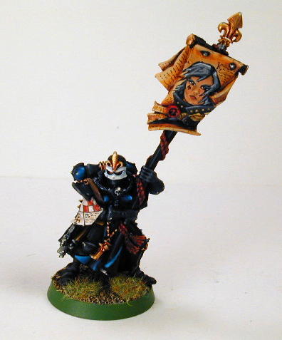
Another example of some freehand practice, this time on a Sister of Battle model I painted for another client sometime in the early to mid 2000's.  I found a great black and white pic in the Witch Hunter codex, drew it out on the banner with a super fine tip Pigma Micron artist technical pen, and then proceeded to colour it in with a fine detail brush.  Took a little bit of time, but this is the kind of detail that tends to impress the average painter, and score a few extra points in painting competitions.  Again, I'm not saying that this is a masterpiece by any means, but you have to keep finding excuses to work on your freehand when you can.  Practice and experimentation is the surest path to excellence.


Fantasy Slaanesh Lords, circa early 2000s.  I know... pink Chaos Lords, how bizarre.  I dunno... it just seemed right to me at the time, and really drew in the viewer's attention on the gaming tabletop.  I didn't mean to use so much of it, but it really was fun to paint.  I did get some flack for painting the Steed of Slaanesh "brown", but I had really wanted to experiment with painting dark flesh, and I'm a firm believer that sexy doesn't just come in caucasian flesh tones (hello Halle Berry!).  This was the old GW "Dark Flesh" as a starting point, with progressive amounts of "Elf Flesh" mixed in for highlights.

My overall goal with these models at the time was to imply pure decadence, as only a devotee of Slaanesh could exemplify.


For sci-fi Warhammer 40,000, less is definately more.  Taking a nod from the Eavy Metal colour scheme, the decadent pastels in Jade Green and pink were used only as spot accent colours.  Black formed a nice neutral backdrop to those colours, and really helped them pop.  Gold also added a bit of shine, as it is essentially a mix of browns and yellows.  Even the steel areas were given a slight shading glaze of blue, in order to emphasize their shine.

Suitably garish, but so much that the details get lost in clutter, eh?  I think all the neutral black "dead" areas give the detail work room to breathe, and make them easier for your eyes to "read".

Now compare those tanks of a decade ago to something I did much more recently:


Try flipping back and forth between this Rhino and the previous Chaos ones.  I've learned quite a bit in the last few years, but I certainly haven't mastered any of the new tricks in my toolkit of skills.  My wet blending needs plenty more work before it becomes seamless... perhaps some more glazes would help?  Weathering is still all about experimentation for me... I just haven't done it often enough to figure out what works best, and what doesn't.  Object Source Lighting (OSL) is still pretty shaky.  And I'm still nervous as heck every time I attempt to use powdered pigments on my miniatures.

My old techniques served me very well, and I'm very comfortable doing them.  However, continuing to paint models in that fashion is a dead end street.  It will lead me nowhere new.  I will have to continue to forge ahead on much rockier paths, climbing new mountains and conquering new obstacles on the way.  If I want to be the kind of artist that I admire, I will have to suffer discomfort and occasional failure to get where I want to be.

Please follow me along for the ride on Sable and Spray.  I could sure use the company.

Monday, 8 July 2013

Painting Trends I'm Not a Fan Of: Pure Edging

I love going down to my local game shop (in this case, Strategies in Vancouver), and picking up a copy of White Dwarf magazine every month.  Yes, I know that the quality and content has been inconsistent, and yes, it's focus is primarily geared towards selling more Games Workshop models, but I can't help it.  I've got an almost uninterrupted collection of WD's dating back to issue 94 (oct '87), and I will likely keep collecting them until my eyes give out.  It's a habit, but there are a few articles once in awhile that make that habit a very rewarding one.

One thing I've noticed, however, is the new fashion / trend of skipping any pretense of shading, blending, layering, glazing, detailing, etc., and going straight to the edge highlights.  Basecoat, maybe a quick wash, and then straight to drawing a line on the edge of your model?  That's got to be the laziest POS since the pure dipped model (the practice of basecoating, then just dunking your model into a shading wash and let dry), or pure drybrush (simply drybrushing your colours straight on to black primer, and calling it done).

Want an example?  Here's one done by Dan Harden, one of the staff writers of White Dwarf:


Really?  This is the paintjob you're so proud of, that you'll put pictures of it into an internationally circulated magazine, and on the GW website?

Granted, it's a clean paintjob.  I've seen MUCH sloppier.  And it does show off some of the details of the model nicely.  But it shows all the hard work and talent of an elementary school child doing "connect-the-dots" with a paint brush.

Edge highlighting has it's place.  Done right, it's the final step of highlighting a nice blend.  It implies a hard edge, and simulates how the light catches those hard edges in real life.  However, simply skipping right to the edging is like putting icing on an unbaked cake mix.  Like spraying car wax on your muddy pickup.  Like sprinkling steak spice on a living cow.  You get the idea...

Now, let's see what a well done (and fully cooked) Tau model looks like:


This is "DarkKnight"'s Tau (pic from Coolminiornot.com).  Notice that the black and yellow ochre areas are edge highlighted white.  However, what makes the whole paintjob look more natural is that the artist took the time to blend the highlights all the way up to that stage.  He did all his intermediate work.  Thus, the model has more depth, and looks much more "3D" than Dan Harden's work.

Okay, so doing it right takes more time.  I get it.  You just want something on the gaming table as quick as possible, without fielding bare metal, plastic, or resin.  I understand.  However, even a few layers of intermediate highlight colours would be better than a single colour highlight.

Below is an example of a model I painted in a reasonably quick amount of time:


I did this Sisters of Battle Immolator for a client about a decade ago.  Yes, the edges are extreme highlighted.  However, I've layered a few stages of intermediate highlights in there as well, so that it builds up to that edge.  This isn't necessarily how I'd paint the model now (I'm currently working on improving my colour modulation technique)... the fashion back then was to exaggerate the edges and details so that the model would pop at arm's length, but not necessarily in a realistic manner.  In fact, now that I think about it, things were much like the edge highlighting trend now... only we were much less lazy and built in a few extra layers of highlighting and shading to smooth things out.  The pure edge highlight is just ridiculous though.  And takes quick and lazy painting to the extreme.

Okay, so I guess I'm expecting too much from a staff writer.  After all, he's not a professional painter, or even aspires to be one.  Surely budding artists aren't going to think that his Tau are the best way to paint minis, and seek to emulate him?

Well, the Eavy Metal painting studio members ARE professional painters (insofar as they fit the dictionary definition of "professional": getting paid to do something).  They are supposed to set the example, and because of the incredible exposure and distribution of their imagery, they set the trends in miniature painting much of the time.  How about an example of their painting?


Better than Dan Harden's Tau by far, but still oversimplifying the edging.  Other than the edges, the blue armour on these marines looks far too flat.  Hardly any depth at all.  The black areas are even worse, but the metal axe head and fabric areas are actually quite nice.

Well, let's compare these marines with some other "professionally painted" marine models, shall we?


Mathieu Fontaine's Ultramarine paintjob really showcases the smooth curvature of the marine armour nicely. The spherical swoops of the helmet and shoulder plates, the tubular shapes of the arms and legs... it's just really nicely done.  Edge highlighting is in there as well, but it's more subtle, not overstated.  He even has a great tutorial posted on his blog regarding this miniature:


I'm a huge fan of Cyril's work as well.  This paintjob dates back to 2004, and it showed real innovation at the time.  Again, there are some spots of edge highlighting here and there, but only where needed, and only to finish off an incredibly smooth and seamless blend highlight.  A lot of thought went into recreating how light would realistically fall on a full scale marine, which is something lacking in a pure edge highlighted model.  Dan's model shows no thought in that regard at all, and just an economy of reasoning in the pursuit of quickly getting his model to the tabletop.


Mikael Duvskog entered this Imperial Fist Space Marine in the 2006 UK Golden Demons, and won a bronze demon for his efforts.  The base is a bit plain by today's competition standards, but his blending of shades and highlights are not.  I would venture to say that he was inspired by Cyril's painting to some degree.  Again, the deep golden brown ochre tones in the recesses of the yellow armour really give this model some depth, and contrast really well with the white edge highlights of overlapping yellow armour panels.  If the Bioware studio artists that did Mass Effect created a game based on Warhammer 40K, this is what I suspect would be the result.

Speaking of 40K games, since much of our 3D modelling techniques are based on (or at least inspired by) 2 dimensional fantasy / sci-fi art, why not have a look at the recently released "Space Marine" game?


Ah, computer "3D" modelling.  Take a look at how the computer renders how light would hit those plates.  Yes, there is some edge highlighting, but mostly as a result of wear and tear on the paint, right down to the lighter coloured primer.  Shadows fall directly underneath the massive shoulder plates.  Rounded armour reflects light like a ball or sphere (which means not necessarily at the apex of the plate, but from the point closest to the light source).

That's how a computer would simulate true-to-life light play, but what about something a bit MORE true-to-life?


Cosplay!!! This is the ultimate "true-scale" modelling.  When we're painting 32mm tall miniatures, we try and fake / recreate the depth of shadows and lights that we see on a full scale (human sized) model.  Notice how there is some "edge highlights".  Most of those are from the hard edge being scratched down to the bare primer from everyday wear and tear, but light DOES catch on hard edges a fair bit... mostly where you see that piece being backlit and silhouetted a bit.  Otherwise, the light does what it did in the computer models shown earlier... the point closest to the light source reflects the most light.  The points furthest from the light source reflect the least light.

Now, go back to the top of this post, and have another look at the edge highlighted Tau.  Not quite the same, is it?  Any shading on that model is NOT the work of the artist, but rather of the lighting that was set up by the photographer.  Good photographer.  Bad artist.

Anyway, this post has gone on long enough.  I probably shouldn't pick on poor Dan Harden too much.  He's spending all his time on trying to put out decent content for one of my favourite magazines (although I'd like it much more if they brought back "Thrud the Barbarian" comics in every issue), which leaves him little time for painting to a higher standard.  However, I have noticed that the average quality of painting in White Dwarf has been steadily dropping.  There are some character models that are still jaw dropping in quality, but the average army looks much flatter than it has in a long, long time.  Instead, I've been going straight to their Golden Demon coverage for truly inspiring paintjobs.  Even for my armies (which have to be painted a bit quicker in order to hit the gaming table before the models are out of date), I can usually come up with a similar, but more time economical way of creating a high standard of painting... one that I wouldn't be too ashamed of presenting in a major magazine seen by gamers and artists all around the world.

Tuesday, 4 June 2013

Portable Painting Setup : Perfect for Lunch Breaks!

It's been three weeks since my last blog post, and for that, I apologize.  However, rather than go into details, how about I give you guys a quick write-up on how to fit more painting into your busy lives.

We're all getting busier and busier as we "grow-up"... we take on more responsibilities at work, at home, at school, and with the family.  Heck, we even spend more time on various hobbies other than painting!  All this cuts into our precious painting time, and that means we either get less painting done, or we start speeding up our work (and letting the level of quality slide as a result).

Personally, I've got two jobs, a wife, a kid, and various other committments that usually come first before painting.  I've been forced to look for little blocks of time where I can shoehorn a good painting session in (usually for parents, it's "The Golden Hour"... the hour just after your kid falls asleep for the night, and you furiously get as much done as you can before exhaustion overtakes you and you fall asleep yourself).  Weekends often present the odd bit of time to yourself as well.  However, I've found that sometimes these short blocks of time often happen OUTSIDE the home.

For example, my work place gives me a generous full hour for lunch.  If I'm quick, I can scarf down a bagged lunch in about 5 minutes (or I can quickly grab something hot from the cafeteria in 15), leaving me with ample time to work on some models.  I've also got a quiet little space all to myself where I can set up, paint (or build / convert), and then tear down before I have to return to work.

So, how can you do the same?  By putting together a small portable painting setup.

First of all, you have to have reasonable expectations.  Unless you're The Flash, you're not likely to get a ton of painting done in that kind of time.  And I'm not the kind of person willing to cut corners on my paintjobs... I try and get every model done to competition level (otherwise I'm not pushing my skills to their limits and beyond).  Therefore, I usually set a short, easy goal for myself.  Usually blending just one area of a model, or perhaps a basecoat over several models at once.

I also have to budget some time for the setup and tear down of my painting, because when I'm done with my break, I still have to do my regular job in that space (the one I get paid to do).  That means you can't afford to do things like set up lights, lay out your whole paint and tool collection, and unpack an  airbrush / compressor too.

So you need something minimal.  Just a few pots of paint, two or three brushes at most, something for your wash water, a few sheets of paper towel, a palatte of some kind, something to carry your model in, and a compact light.  Something like this:


This is a small pistol case (you can find them at any firearms store, or even in the hunting section of an outdoors or hardware store).  Inside, I pack my miniature(s), a few pots of paint, 2 or 3 brushes (with caps on to keep the bristles from being bent out of shape), some medium (for blending), a little bit of brush soap (gotta keep those expensive brushes in top shape), an LED lamp that I got at an outdoor supplies store (if it's bright enough for camping, it's usually bright enough for painting), my wet palatte (this is the Privateer Press one, but notice that I replaced the crap packing foam for a proper art store wet palatte sponge), and a leftover cottage cheese tub that I can use for my wash water.

I have access to plenty of paper towels at work, so I didn't need to pack any sheets inside my kit.  I also carry a bike water bottle with me most of the time, which carries enough water for wetting my palatte and filling my wash tub.  If you're particularly paranoid about leaving a mess, you can lay out a few newspapers over your painting area first.

Packed up for travel, it all looks like this:


A small assemble that can fit inside a backpack or other bag quite easily.  And I would highly recommend you put that pistol case in a bag before carrying it around... I'm quite fortunate that I work in a police station, where two thirds of my co-workers walk around packing heat anyway, but your work place might not be so understanding.  And if you plan on flying with this, I'd replace the gun case with something else entirely...

I also recommend you label everything.  If you're travelling with kit, it's much more likely you're going to misplace or lose something.  It's very possible that your missing stuff will make it's way back to you if your name and contact info is on it.

Not bad, is it?  I've taken this little bit of kit everywhere... to my parent's place, to my buddies homes, to the local game shop, on road trips, and even on holidays.  I might take more paints and models with me sometimes, in which case I bring a separate box for them, but that's only if I think I'll have plenty of time to work on my models.

I'll often pack something similar if I only plan on building or prepping some models for painting.  In that case, instead of paints, brushes, etc., I'll bring needle files, clippers, glue, zip kick (a glue accelerator), hobby knife, etc.

Again, this is a small kit, suitable for rather short sessions.  If you're the type of person who would rather work on some models than read a newspaper or surf the Net on your iPhone, then this kind of setup might just work for you too.  Even if you only get 30 minutes of painting in, over time that adds up to quite a bit of work accomplished.  And, of course, we all know that the more painting we get done, the more practice we get under our belt, and the better we get.  Not everyone gets to paint for a living and do it 40 or more hours a week (been there, done that)... some of us get paid to do something entirely different (along with benefits and a pension), and have to fit our painting in wherever and whenever we can...

Now that I've put my paints away, I guess it's time to get back to work :


I love my job.