
Ah, classic Jes Goodwin sculpted Adeptus Arbites. I can't recall when I painted these, or when I eventually got around to selling them (if it wasn't for my roller-coaster ride of a bank account back in the days of being a "pro" painter, I probably would have kept these), but I'm guessing they were painted in the mid '90s, and sold probably somewhere around 2000.
Man, do I ever miss these models. While there wasn't much variety in the unit, and they did exhibit the classic "one-piece" stance (which I kinda like anyway... but more out of gaming / ease of transport practicality and nostalgia), in my opinion they were still superior to the Necromunda versions that eventually replaced them. First of all, these were done by Jes Goodwin: the Leonardo da Vinci of Games Workshop concept artists and sculptors. Super clean sculpts which were devoid of any unnecessary clutter (thus making them very easy for your eyes to "read"). They were a joy to prep and paint.
The paintjob was completely within the prevailing Eavy Metal fashion of the time. Uber-saturated reds, vibrant blues, super shiny metals, and a drybrushed brown earth base with a touch of static grass and a Goblin Green rim. Classic. And pretty darn easy to do, if you handled a brush with any precision and knew how to thin down your paints a bit. The biggest challenge was to not overdo the highlights on the black. Leave the vast majority of the space just a teensy touch lighter than pure black (pure black was reserved for the deepest recesses), and sharply ramp up the highlights through all the tones of grey towards the edges, and just hitting the tips with a tiny reflective point of white.
One neat touch was the expended shotgun shells on the bases. Not knowing any better, I just did what everyone else did to represent boltgun shells: slice up little bits of brass tubing and glue them below the guns. As for the pic... I just HAD to pose these bad-boy law enforcement officers atop my Jes Goodwin sketchbook.
Very sharp models. Having just watched the latest Judge Dredd movie reboot recently (starring Karl Urban, who outdid Sylvester Stallone by a HUGE margin), I can say that I feel an almost physical pain when I look back on this pic and feel a gaping void in my miniature collection. If GW still offered a classic model bits ordering service, I'd pick these up again in a heartbeat.

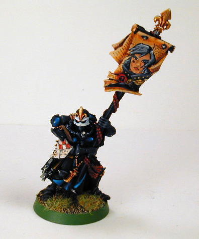
These were Rackham Confrontation models that a client requested I paint up to fit in his High Elf army (around 2003? 2004?). In a previous blog post, I detailed how Confrontation models took some time to gain traction in the North American market. As far as gamers went, we knew these models were far superior in dynamic pose and art style to many of the GW models we'd been gaming with up to that point. Many decided to keep playing our beloved GW games, but simply pick up a few Confrontation proxy models to stand in once in awhile. Kind of like how Hollywood actresses use body doubles for close-up nude scenes and gratuitous butt shots.
While not tournament legal (GW tournament rules state that the models used must be actual GW models), proxy models were still somewhat common in usage at the time. So long as the models resembled the original GW concepts closely enough that very little explanation was needed for your opponent to know what he / she was facing, they were good for light hearted friendly games of Warhammer, Warhammer 40K, or any other GW game system. In this particular case, these "Lions of Alahan" (I believe) were nice stand-ins for High Elf Silver Helms.
In order to fit in to the client's existing High Elf army, I used the standard GW paint scheme. However, Rackham sculptors excelled at creating very deep and intricate detail, which really lent themselves to a stunning amount of tonal contrast. Much more time consuming to paint though... and the models ranked up (stood side by side with bases touching one another) very poorly. In the game Confrontation, each model is handled separately, so often the only models coming into contact with them would be ones belonging to your opponent. That, and it seemed like the Rackham miniature creation process was entirely backwards to what GW did at the time: Rackham concept artists had all sorts of freedom to create interesting designs, which were passed on to the sculptors, and after the model was finished, THEN a game designer would be tasked with creating rules for that model. While GW models underwent the same process way back in the early editions of Warhammer Fantasy and 40,000 (mid to late eighties), by the time of these models, the rules came first. This meant that most Rackham models were primarily art pieces first, and game pieces second.
I should say that the practice of using proxy models was very common back in the '80s, as GW simply couldn't create models for every unit, character, and monster featured in their army lists. This led to all sorts of amusing gaming scenarios... I once battled against Lego mini-figure stand-ins and a monster that was sculpted out of Silly Putty five minutes before the game started!
During the '90s and early 2000s, proxying models was far less common. GW had a huge stable of miniature sculptors during that time, and they often made sure the models were produced and ready for sale months (if not years) before the rules for them were released. In addition, there were only a few miniature companies in operation during that era (perhaps it required far more capital to start a miniature company back then? Also, it seemed much more difficult for a small miniature company to get exposure and earn a good reputation than it does now). That being said, there were often many sculpts that were released by GW at that time that were definately sub-par... they had a schedule to keep to, and many gamers would purchase an awful sculpt just so they had an official GW model to field on the gaming tabletop.
Nowadays there are a vast number of miniature companies creating models specifically aimed at living their tabletop lives as proxy stand-ins. While Games Workshop lawyers are kept busy going after the ones most blatently ripped off of GW concept art, imagery, and existing miniatures, many other "independent interpretations" of their line sell... and sell well. Companies such as Ultraforge, Raging Heroes, Dreamforge, Scibor, Bane Legions, Avatars of War, etc. etc. etc. make a living being the Ramora fish to the GW shark.
Before I move on to the next pic, let me finish this thought with a funny story that my friend Jeremy (one of the founders and sculptors of Ultraforge Miniatures) told me after he sold the company only a few years after starting it. I met Jeremy back when he was a lowly GW red-shirt (retail salesperson), shortly after my 2 years stint doing the same job. At the time, he was a decent painter, and just learning to sculpt. In a very short amount of time, he progressed to being a superlative painter, and just as superlative as a sculptor (I suspected brain steroids...). He left GW and went on to found Ultraforge with his equally talented girlfriend, and produce some absolutely stunning miniatures. However, because of his immense love for the GW worlds, most of those miniatures were based very heavily on GW concepts.
One of those miniatures was a "Plague Daemon" that was an upsized version of the metal GW Greater Daemon of Nurgle (Forgeworld now makes their own super-sized one). I can't find it on the Ultraforge website at the moment (otherwise I'd post a pic), but trust me... it was a better version of the metal GW model offered at the time (much more character, much more detail). Shortly after it was released, Jeremy got an email from none other than John Blanche himself! In it, John (wait, that just sounds wrong... I should say, "Mr. Blanche") raged at Jeremy, saying that he was stealing IP, and thus stealing money away from the Blanche family and kids. Jeremy was horrified... this was his idol, and Mr. Blanche was really pissed off at him!
Now, I don't know how much of that story was true... perhaps some of it was exaggerated (as stories often get), but I kind of agree with Mr. Blanche. I majored in Creative Writing and English Literature back in University, and one thing that was hammered into me at the time was that Intellectual Property is still property... if you steal it, you are stealing someone's livelihood and creative work. That being said, Jeremy's original intention was to pay homage to John Blanche's work, and because he believed that the existing GW sculpt did not live up to that work. The situation was a bit complicated, and I have to say that I felt very strongly for BOTH parties involved.

Speaking of High Elves, these High Elf Dragon Princes were part of my very first Warhammer Fantasy army, which I painted sometime back in the early '90s. I had collected and painted various GW Fantasy models before that of course, but usually just a few models here and there, from whatever race or army I felt like. That High Elf army was my first attempt at putting together an entire Fantasy army to game with (I had a 40K Ork and Imperial Fist Space Marine army already at the time though).
These were strongly influenced by the Eavy Metal studio army featured in White Dwarf magazine at the time. Mine differed in some ways... I tried to simplify the colour scheme a bit, and did my own freehand on the banner. This pic doesn't capture the other side, but instead of a wing, that side showed a dragon's head breathing big gouts of fire. It was fairly simple to do... I sketched out the design with a mechanical pencil, which I then painted in with a detail brush and a steady hand. Having filled all my university electives with visual arts courses (I couldn't bear the thought of doing MORE Chaucer, Shakespeare, or early North American Literature), drawing and painting seemed to come naturally to me. That, and many years of drawing comic book characters in all my notebooks as a child.
Somehow I stopped drawing and painting for whatever reason shortly after dropping out of university. It is one of my biggest regrets, as I can now tell you from personal experience, those skills are very perishable. Once you stop working out your creative muscles, they slowly degrade to the point of uselessness. It may take years, but just like my former ability to play piano and to speak Korean fluently, it takes constant practice to keep those hard-earned programmed brain pathways intact.
Sadly, I sold off that High Elf army for much less than the cost of the bare metal during my time at GW. They had earned me a few "Best Painted" awards up to that point (wasn't much of a painting scene in my neck of the woods at the time), and while my painting has evolved quite a bit since then, there is something about those early paintjobs of mine that I am really fond of now. Perhaps it's just because those models now represent a time when I really enjoyed painting and gaming far more than I do even now.

This Forgeworld Eldar super heavy flyer was a blatant rip-off of the studio paintjob, as per the client's instructions. Since there weren't any tutorials on how to recreate this scheme, I studied the pics I had on hand and simply tried to "reverse-engineer" the original artist's work. Each and every scale was freehand painted, and each scale was shaded, highlighted, and glazed. There's a dragon face of sorts on the front, and the flames on the wingtips were my own extra touch. Incredibly time consuming work, but I don't consider it one of the most challenging paintjobs to pull off if you've got the time, the patience, a good set of brushes, and a steady hand.
I actually did a smaller Wave Serpent (the old Forgeworld resin one) in the same colour scheme some time after this model was completed. It just so happened that I was headed down to Conflict Seattle (a smaller version of Games Day), and I was able to enter it in the painting competition that year. It picked up the "Best in Show" trophy, despite what the US White Dwarf magazine reported... and I have the pic to prove it:

I also entered a bunch of other models I had lying around the studio, and somehow managed to win EVERY catagory except the Youngbloods one, and perhaps one other (I think I was missing a Lord of the Rings entry). They were a bit lean on prizes that year, and I collected a nice stack of laminated certificates instead of trophies for each of those. It was a nice surprise, marred only somewhat by the shoddy reporting in a following White Dwarf magazine that reported someone else's name as the overall winner. It would have been nice to get proper credit for that win, but oh well. Seeing as I wasn't even expecting to win anything at all (wasn't Washington State supposed to be some sort of gaming mecca? I mean, Wizards of the Coast, Privateer Press, and many other gaming companies are based out of that state!), I was happy for the win regardless.

This Forgeworld Shadowsword super heavy tank pre-dated the current plastic kit by almost a decade. With large kits like this, with so many parts, the likelihood of at least SOME parts arriving warped or poorly cast was pretty high. When coming up with a quote to give the client, you would have to work in some extra time for assembly and prep. With the new plastic kits, I find that the possibility of mis-casts is much lower, and even if you do come across a badly cast or packaged kit, you simply return it to the retail store for an exchange on the spot. Like or hate GW (and I really don't think the ratio is any different than years past), you can't deny that they do plastic kits better than any other miniature gaming company out there at the moment.
Anyway, I must have done this particular kit up sometime in the early 2000's. It was a simple paintjob... drybrushed tracks, edge highlighting (with as many intermediate tones of layered highlights as it took to make them look smooth), some "urban" camo patterning (which was also shaded and highlighted), and a bit of freehand.
I've always liked WW2 pin-up nose art. There's something really cheeky about it, and it really lends each mass-produced vehicle it's own personality and character. With this particular tank, I thought to do the same, and dubbed it the, "Divine Inspiration". Unfortunately, my art skills had deteriorated somewhat since my university days, and my mastery with a detail brush wasn't quite as good as I would have liked either, and so the end result didn't come close to matching the brilliance of someone like Andrew Bawidamann (be sure to click on my link to check out his website... it's awesome!). Oh well... I was still pretty happy with the result, and it had enough promise to encourage me to keep trying out stuff like this in the future.
And before anyone says, "Oh, it's not THAT bad", check out Karol Rudyk's work:

Yeah... I've got a LONG way to go before I can do this... if ever...
Another example of some freehand practice, this time on a Sister of Battle model I painted for another client sometime in the early to mid 2000's. I found a great black and white pic in the Witch Hunter codex, drew it out on the banner with a super fine tip Pigma Micron artist technical pen, and then proceeded to colour it in with a fine detail brush. Took a little bit of time, but this is the kind of detail that tends to impress the average painter, and score a few extra points in painting competitions. Again, I'm not saying that this is a masterpiece by any means, but you have to keep finding excuses to work on your freehand when you can. Practice and experimentation is the surest path to excellence.


Fantasy Slaanesh Lords, circa early 2000s. I know... pink Chaos Lords, how bizarre. I dunno... it just seemed right to me at the time, and really drew in the viewer's attention on the gaming tabletop. I didn't mean to use so much of it, but it really was fun to paint. I did get some flack for painting the Steed of Slaanesh "brown", but I had really wanted to experiment with painting dark flesh, and I'm a firm believer that sexy doesn't just come in caucasian flesh tones (hello Halle Berry!). This was the old GW "Dark Flesh" as a starting point, with progressive amounts of "Elf Flesh" mixed in for highlights.
My overall goal with these models at the time was to imply pure decadence, as only a devotee of Slaanesh could exemplify.


For sci-fi Warhammer 40,000, less is definately more. Taking a nod from the Eavy Metal colour scheme, the decadent pastels in Jade Green and pink were used only as spot accent colours. Black formed a nice neutral backdrop to those colours, and really helped them pop. Gold also added a bit of shine, as it is essentially a mix of browns and yellows. Even the steel areas were given a slight shading glaze of blue, in order to emphasize their shine.
Suitably garish, but so much that the details get lost in clutter, eh? I think all the neutral black "dead" areas give the detail work room to breathe, and make them easier for your eyes to "read".
Now compare those tanks of a decade ago to something I did much more recently:

Try flipping back and forth between this Rhino and the previous Chaos ones. I've learned quite a bit in the last few years, but I certainly haven't mastered any of the new tricks in my toolkit of skills. My wet blending needs plenty more work before it becomes seamless... perhaps some more glazes would help? Weathering is still all about experimentation for me... I just haven't done it often enough to figure out what works best, and what doesn't. Object Source Lighting (OSL) is still pretty shaky. And I'm still nervous as heck every time I attempt to use powdered pigments on my miniatures.
My old techniques served me very well, and I'm very comfortable doing them. However, continuing to paint models in that fashion is a dead end street. It will lead me nowhere new. I will have to continue to forge ahead on much rockier paths, climbing new mountains and conquering new obstacles on the way. If I want to be the kind of artist that I admire, I will have to suffer discomfort and occasional failure to get where I want to be.
Please follow me along for the ride on Sable and Spray. I could sure use the company.


